Why Negative Comments May Not be a Bad Thing

No one likes receiving negative comments or reviews. 

Unfortunately, negative comments are often out of your control and can occur at any time. But negative comments online provide your business with an opportunity to respond and be a part of the conversation.

Not all negative comments cause harm. Sometimes, these comments can make you aware of issues that you didn’t know existed and can provide you with the opportunity to demonstrate your exceptional customer service.

However, it can be more damaging to your brand to delete these negative comments rather than deal with them.

The way your business handles negative comments is important, it demonstrates the level of customer service that you offer. One big no-no is to be defensive. Handle it like a boss, and you may turn the negativity into a positive.

We’ve put together some examples of social media fails that businesses have responded to and ultimately managed to turn the situation around.

Chevrolet

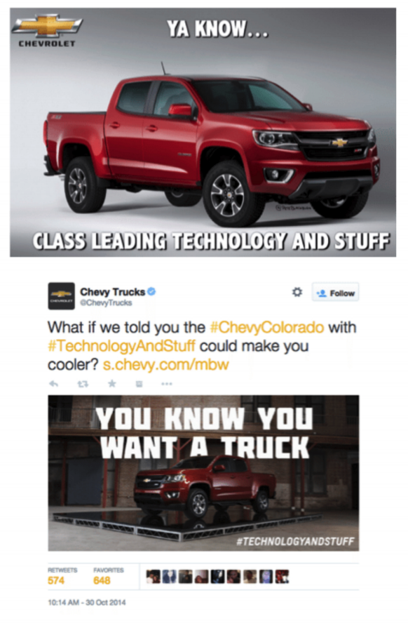
Okay, so this one is not technically a social media fail turned into a positive, but it’s a good example of a company owning a mistake and turning it into a success. Chevrolet was quick on their feet and able to avoid an epic social media meltdown.

Back in 2014, Chevrolet spokesman Rikk Wilde was presenting keys to the new Chevy Colorado Bumgarner to the MVP and the man who gave the car its name – baseball player MVP Madison Bumgarner. (Interesting fact – he is commonly known as Madbum). Rikki Wilde tried to describe the features of the truck and said, “Combines class winning and leading, um, you know, technology and stuff”.

Chevrolet was quick to own this blunder on their social media campaign by acknowledging the humour and ridiculousness through memes. It went viral on Twitter! Chevrolet turned this fumble to their advantage, and it provided them with an opportunity to add a little personality.
Woolworths

Now, poor old Woolies get their fair share (maybe even more) of negative comments on social media, especially on Facebook. Perusing their official Facebook page, there are numerous negative comments.

However, Woolworths is good at identifying a good opportunity when it presents itself.

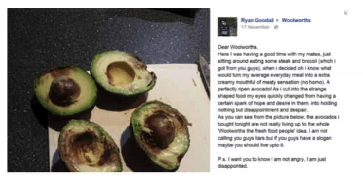
In 2014, a customer called Ryan Goodall commented on the official Woolworths Facebook page, expressing his disappointment over an overripe avocado.
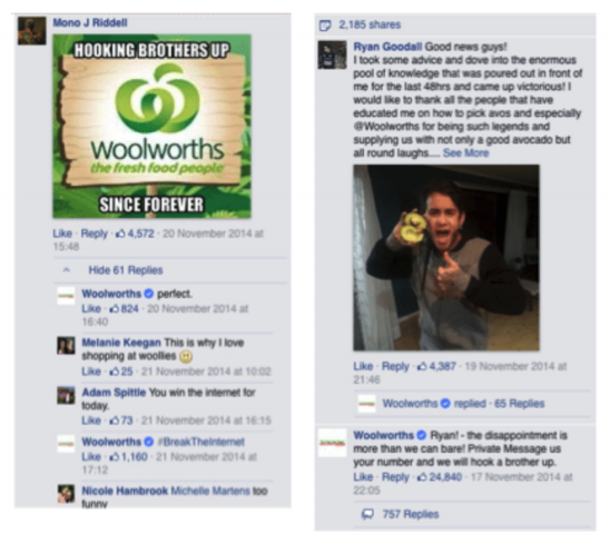
Within the hour, Woolworths addressed the issue and kept the mood light and humorous by saying, “Ryan! The disappointment is more than we can bare! Private message us your number and we will hook a brother up.” This had a positive response with other Facebook users as the post had 2185 shares, and customers creating memes.
MAC Cosmetics

MAC cosmetics shared an image on Instagram in January, from New York Fashion Week, a close up of a model’s lips wearing “Matte Royal”.
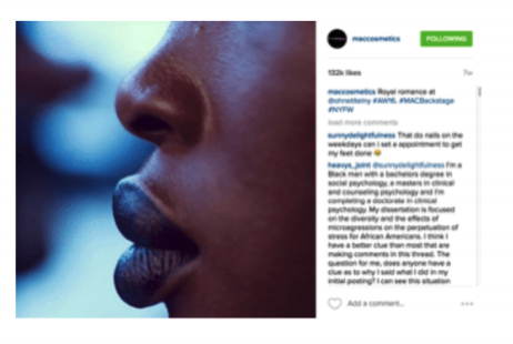

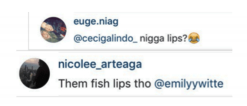
As a result, there were racist comments related to the model. There are currently over 26,279 comments on the image.
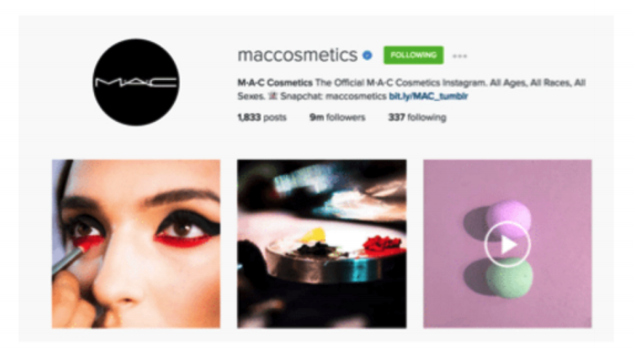
This image went viral, and Mac Cosmetics had to respond quickly. As the image was posted on Instagram, it is difficult to reply to each individual commenter so MAC addressed it in their Instagram bio, “The Official M-A-C Cosmetics Instagram. All Ages, All Races, All Sexes.”
Beyoncé would be proud.

Adidas

In the spirit of Valentine’s Day and all things love and romance, Adidas posted a photo on Instagram of two ladies wearing Adidas shoes, and with the caption, “The love you take is equal to the love you make”. This image quickly gained media attention, with articles on Huffington Post to Perez Hilton and US magazine and has over 171,175 comments and 304,000 likes.
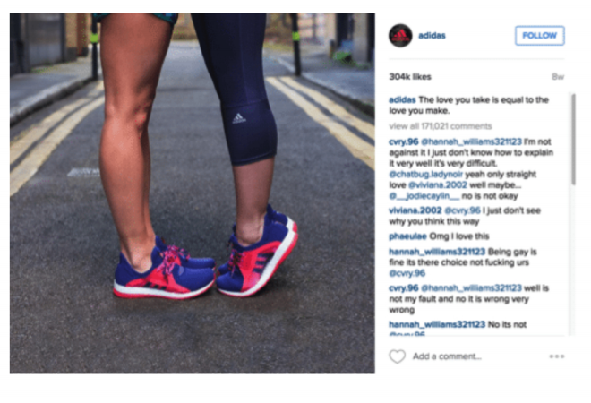
Regrettably, similar to MAC cosmetics, it was met with a number of negative comments. Adidas employed a more direct approach to handling the trolls; to show how seriously they take their zero tolerance policy with homophobia they responded to a majority of comments with a side of cheekiness by using a well-placed emoji and wishing everyone a happy Valentine’s Day. (Also Adidas has added a non-homophobic clause in their contracts with their athletes – they can’t be terminated or have a change in the contract if an athlete reveals publicly that they are lesbian, gay, bisexual or transgender – we love it!)

Bodyform

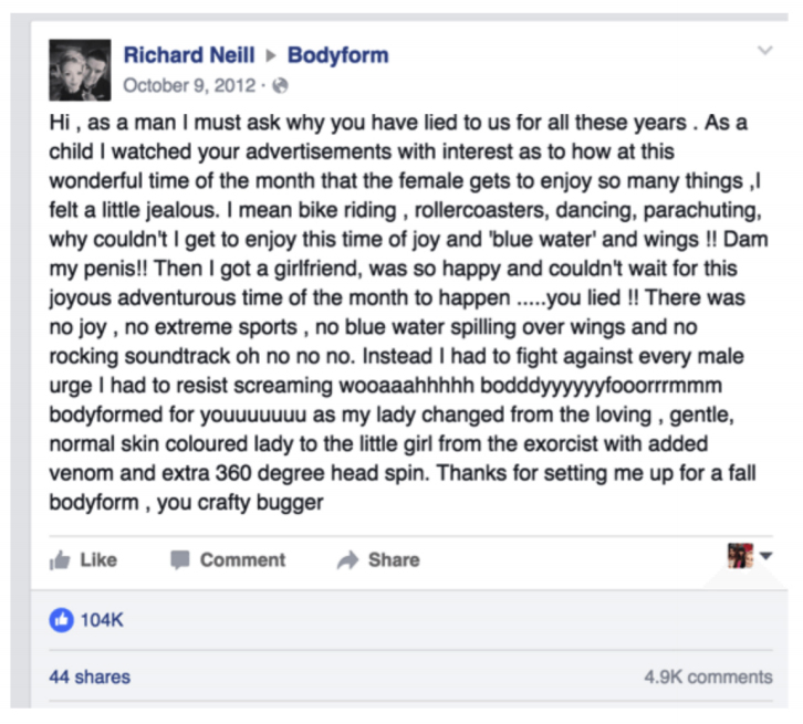
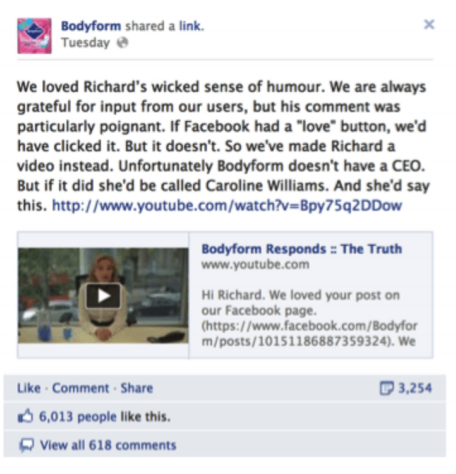
This one is an oldie, but a goodie! Back in 2012, British man Richard Neill commented on Bodyform’s Facebook Page about the misleading female product advertisements and asking why the company had “lied” about the female time of the month. The post gained popularity swiftly, gaining 104,000 likes.
Bodyform quickly responded, and took it to the next level by creating a video to respond. The video resulting in becoming very popular with both males and females, with 5,782,937 views on Youtube alone. The tongue in cheek response was taken very well with audiences and gained a favorable outcome.

The video is hilarious and witty from the get go, the fictional CEO Caroline Williams states, “I think it’s time we came clean… We lied to you, Richard and I want to say sorry… Sorry”. She then goes on to explain why the company had to use metaphorical imagery as the men were unable to handle the truth of the “blood coursing from our uteri like a crimson landslide” and drinks a clear blue liquid.

You can watch the hilarious video here.
So there you have it! Negative comments don’t always result in long-term negative consequences.

These companies made the conscious decision to handle and respond to these negative situations; they have gained invaluable brand awareness, experience and a fresh perspective from consumers. They may have even gained a few followers along the way…

Get out there and respond to all of your comments – the good and the bad, like a boss, and have fun!

Still struggling? Head over to our blog on trolls and how to manage them

Ready to build, nurture or evolve your brand?

Get in touch
Contents
I’ve always been fascinated by symbolism 🌀

By how a single mark, image, word or gesture can represent something far bigger than itself. Across cultures and civilisations, we’ve used symbols to communicate identity, beliefs, stories, belonging and ideas that sometimes go far beyond what words can explain.

And somewhere along the way, I realised that’s also how I’d started to see brands.

A logo can become a symbol of what a business stands for. A colour can carry years of recognition. A phrase can represent an entire belief. A story can become shorthand for where a business came from and why it exists. Iconography can represent services, philosophies, products or ideas.

What we see on the surface carries meaning because of everything sitting behind it.

Over nearly two decades of working in branding, I also began noticing the same themes appearing again and again in the businesses people really remembered.

Their past, beliefs, future, people, identity, expression, impact and longevity.

Eventually, I gave each of those ideas a symbolic form.

They became Oraco’s Eight Brand Marks, and today they give us a way to look at a business from eight different perspectives and uncover the stories, ideas and meaning that make it distinctly its own.

The strongest brands aren’t built by adding meaning that was never there. More often, the clues already exist.

You just need to know where to look.

Explore the Eight Brand Marks via the link in bio.
One of the hardest things about running a business is knowing what actually deserves your attention.

When you're inside it every day, everything can feel important. The website needs updating, content needs creating, marketing isn't quite working, the messaging feels off. Someone suggests a new platform, another campaign or a complete change in direction. But more activity isn't always the answer.

A big part of Jessica's work, both through Oraco and the business owners she mentors, is helping people step back far enough to see what's really going on.

– What are you actually trying to achieve?
– Who are you trying to reach?
– What's already working?
– Where is the real disconnect?
– And what can probably wait?

Sometimes the most valuable strategy isn't adding another thing to the list. It's creating enough clarity to know what matters now, what comes next and what doesn't need your attention at all.

If you're looking for strategic advice, a fresh perspective and someone to keep you accountable to actually doing the things you said you were going to do, Jessica offers one-on-one business strategy and mentoring sessions. Shoot us a DM to find out more.
Last week, we lost someone very special.

Sean was a former Principal of Mannix College, a longstanding client of Oraco's, and someone I was lucky to get to know over many years.

I first met Sean in 2012 through my work with Mannix, and I remember instantly clicking with him. He was incredibly kind, funny, super organised and genuinely caring. He made working together easy, but he was also someone who took the time to get to know you beyond the work itself.

Every year, without fail, Sean would send me a Merry Christmas and Happy New Year message, always accompanied by a quirky little Bitmoji of himself. Even after he finished as Principal and we were no longer working together regularly, those messages continued. It's such a small thing, but I think it says a lot about the kind of person he was.

I've worked with Mannix since 2009, a relationship that now spans close to two decades, and Sean sits right in the middle of so many of those memories. He was there through an important chapter in my career and Oraco's growth, trusting us with Mannix for many years, and still making the effort to stay in touch long after our working relationship changed.

Looking back, it means a lot that such a longstanding professional relationship also brought someone like Sean into my life.

As the Mannix community gathers today to celebrate Sean's life, I'll be joining the service from home and thinking of his family, friends and everyone at Mannix. I had hoped to be there in person, but I'm glad I'll still be able to join everyone in remembering him.

Thank you, Sean, for your kindness, your humour and for always finding a way to put a smile on people's faces. You made a difference to so many people, myself included, and I'm very grateful our paths crossed.

Leanne x

Photo courtesy of Mannix College.
One year of @twobayslaundry 🤎

A year ago, Two Bays Laundry opened its doors with a brand we’d had the pleasure of helping Liz and Kirill bring to life from the very beginning.

From strategy through to the visual identity, we wanted to create a brand that felt fresh, organic and full of personality, but most importantly, one that felt like it belonged here on the Mornington Peninsula.

That sense of place became part of the identity itself. The curves within the logo draw on the movement of water and our coastline, while the stylised ‘B’ represents the two bays that gave the business its name, Western Port and Port Phillip. The coastal palette, natural textures and broader identity carried that story through the space (shout out to @saint.design.interiors), signage, uniforms, vehicles and everything in between.

It’s always pretty special seeing a brand move from ideas on a page into a real business, but even more so watching it become part of the local community.

A huge congratulations to Liz, Kirill and the whole Two Bays Laundry team on your first birthday. It’s been such a pleasure working alongside you from those early ideas through to launch and everything that has followed.

Happy first birthday! Here’s to everything still to come 🥂
We don’t believe the best brand stories are invented.

They’re found in the reasons a business began, the decisions made along the way and the people behind it. The things they care about, do differently, and perhaps don’t even realise are interesting anymore.

Often, you’re too close to your own business to see what someone else might find remarkable.

That’s why we ask questions, listen and look a little closer.

The story is already there. You just have to know where to look.
At the heart of @joannaphotography.au’s new identity is a refined wordmark designed to balance timeless elegance with a sense of movement and connection.

A sophisticated serif typeface was chosen for its enduring quality, warmth and understated premium feel. The letterforms evoke a sense of craftsmanship and longevity, reflecting the brand’s focus on creating imagery that grows in meaning over time.

Connection between the A and N introduces a sense of movement and continuity, symbolising the relationships, stories and moments that unfold throughout life.

This is why we start with your story. It’s often where the most distinctive part of a brand identity is hiding.

•

Filed by: Oraco Agency
Reference: PF-4165
Photo source: @joannaphotography.au 
Filed under: #ProjectFile #BrandStrategist #Branding #BrandDesign #LogoDesign

ABOUT THE AUTHOR

Picture of Oraco

Oraco

We are designers, strategists, storytellers, coders, animal lovers, travellers, adventurers, yogis, gig-goers and coffee, tea & wine enthusiasts. We are for culture that fuels progressive and imaginative thoughts. We value positive change and believe in equality. We expect accountability. We aspire to create a work-life balance. We enjoy teamwork and contribution.

Leave a Reply

Your email address will not be published. Required fields are marked *

Branding Agency

Join the Oraco Passage

Build, nurture and evolve your brand with our actionable tips and insights delivered straight to your inbox.