We’ve said it a hundred times before, but we’ll say it again – your brand is SO much more than your logo. All the best brands we love have comprehensive branding strategies that have allowed them to grow into the well-known businesses we know and love today. It’s important to highlight this strategy includes everything from their logo right down to their tone of voice and how they interact with their community.
To reiterate our passion for branding and to celebrate our current Branding Bootcamp, we have put together a list of brands that we love and explained why they are memorable. We hope you enjoy reading about team Oraco’s favourite brands!
Who Gives a Crap
Not only is Who Gives a Crap (WGAC) a sustainable business (that totally aligns with our values), but they have fantastic branding. On paper, a sustainable toilet paper company doesn’t sound like anything exciting. In fact, it sounds downright boring. But WGAC has developed a brand and a product that we love.
The brand
WGAC was founded by three Aussie blokes who were shocked to learn that 2.4 billion people don’t have access to a toilet – roughly 40% of the global population. This results in around 289,000 children under five dying from diarrhoeal diseases caused by poor water and sanitation – this can be broken down to almost 800 children per day or nearly one child every two minutes.
From here, WGAC was born. They’re B Corp™ certified for the highest standards of social and environmental impact, donating 50% of their business’s profits to help build toilets.
Our favourite things
What’s not to love about an environmentally friendly brand that uses (literal) toilet humour to engage its audience?! They have a whopping 274k followers on Instagram, and their witty banter and poo puns make it a popular account to follow. Even though it’s an entertaining page to scroll through, there’s also an underlying message that they’re putting out there and trying to generate new leads to help with their overall mission.
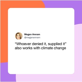

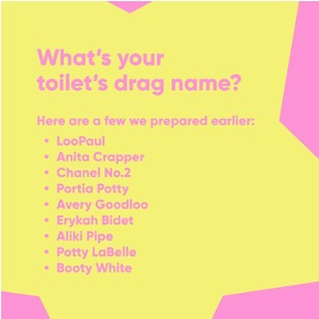
Source: WGAC Instagram
Pana Organic
A plant-based company that specialises in delicious foods? Count us in! Pana Organic is vegan, organic and endorsed by Coeliac Australia. In other words, it ticks all our boxes! They manufacture chocolate, ice cream and plenty of other yummy treats that the Oraco team love snacking on in the office.
The brand
This Melbourne-based business is passionate about creating amazing, vegan, organic food for every occasion. They develop foods full of nothing but nourishing goodness for their customers and the earth. You can find their products in stores around the country, including Coles, Woolworths, and Independent Grocers.
Our favourite things
Apart from the fact that they create delicious foods with only the good stuff in them, their packaging and branding are gorgeous. The packaging is all recyclable, the inks are plant-based, and they never compromise on quality. Their colours are natural, earthy tones and feature the occasional metallic flecks in silvers and golds. They’ve accumulated a large following on Instagram of 248k followers, and their feed is drool-worthy!
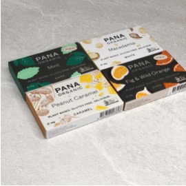
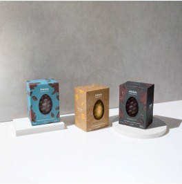
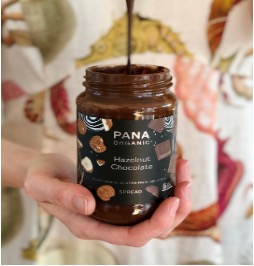
Image source: Pana Organic Instagram
Vegemite
We couldn’t pass up the opportunity to talk about one of the most iconic Australian brands – Vegemite. Next year Vegemite celebrates its 100th birthday – an incredible milestone whether you love or loathe this Aussie spread! Although this brand has had to evolve to keep relevant, the core remains the same.
The brand
Every Australian knows the famous ‘Happy little Vegemite’ song (it puts a rose in all our cheeks!), but this brand has grown an empire over the last century. What started as a humble spread has developed into an Australian staple. In 2018, Vegemite extended its brand out from the pantry and created a range of merchandise for its loving audience.
Our favourite things
As a business that specialises in branding, we LOVE the way Vegemite has grown and changed with the times whilst keeping its core colours and shapes the same.
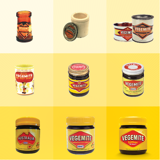
Image source: Vegemite’s Facebook Page
Their Instagram has grown to a healthy 78.4k followers and uses a combination of images and tile posts to create an aesthetically pleasing feed. They use this platform to hit a demographic of Aussies who have grown up with the brand and often have posts that aim to invoke feelings of nostalgia.
One of our favourite things about Vegemite and their brand was a campaign they ran recently. During the Australian Open, they noted that the United Kingdom has an official tennis-watching dish – strawberries and cream – but Australia didn’t. So, the brand took the matter into its own hands and paired up with an Australian icon, Ash Barty, to present the ultimate Aussie tennis dish – the Barty Parmy.
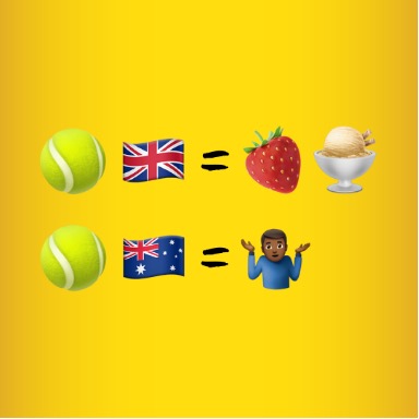
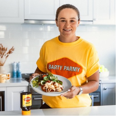
Image Source: Vegemite Instagram
Implementing strong, on-brand campaigns makes your brand memorable – especially one that ticks all the boxes with its target audience. Go Ash!
kikki.K
As an agency, there’s nothing we love more than stationery. Especially a business whose branding is on point! Kristina ‘Kikki’ Karlsson was the one who had the dream for one of our favourite stationery brands – kikki.K.
The brand
When creating her brand, Kristina wanted to create and share beautiful stationery. She envisaged her stationary line to be:
- Thoughtfully designed.
- Functional and meaningful.
- Things that would draw on her Swedish heritage and love of learning and positive living.
- Things that brought a genuine spark of joy to everyday life.
Our favourite things
It’s hard to look past their Instagram feed when looking through our favourite things. Their grid is aesthetically pleasing, and both the images and designed tiles they use are done well. We love the pastel tones that they use throughout the feed to align with their overall brand aesthetic and the neatness and organisation reflected throughout.
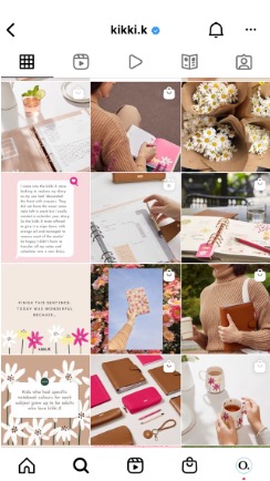
Image source: kikki.K Instagram
One of the other things kikki.K does well is community management. Across both their Facebook and Instagram platforms, they engage and try to respond to almost every comment. This helps to keep the community engaged and loyal, as it humanises the brand.
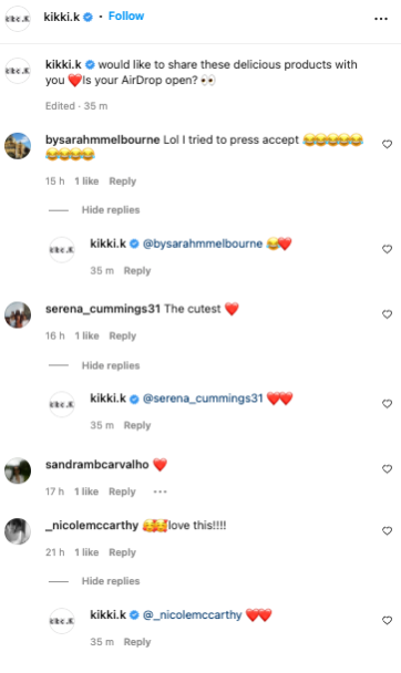
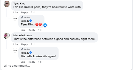
Image souce: kikki.K Instagram and Facebook
Commonfolk Coffee
What do we love? Coffee! What do we love more? A coffee company that satisfies our tastebuds and our conscience! Commonfolk Coffee not only have three cafes in Melbourne, but they supply coffee beans to businesses and consumers alike. They have other things besides coffee, though, with tea, chocolate, chai and a range of food in their cafes.
The brand
The coffee’s good, but the brand’s even better. Commonfolk source their coffee beans in a socially responsible and regenerative way. They pay better, invest in their producers and commit for the long term so that they can see their partners and the coffee industry thrive long into the future. Commonfolk has a program called ‘The Cup That Counts’ – an initiative that invests back into the depths of the coffee industry. Twenty cents from every cup of coffee sold is reinvested into contributing to building a coffee industry that is fair for everyone involved.
Our favourite things
The coffee. That’s it.
Just kidding! Besides having a quality brew, they have a quality brand. Their website shop is anything but boring, with GIFs instead of images showcasing their products (you can check it out here). They use bright colours and moveable elements to catch your attention and make their products even more enticing to purchase!
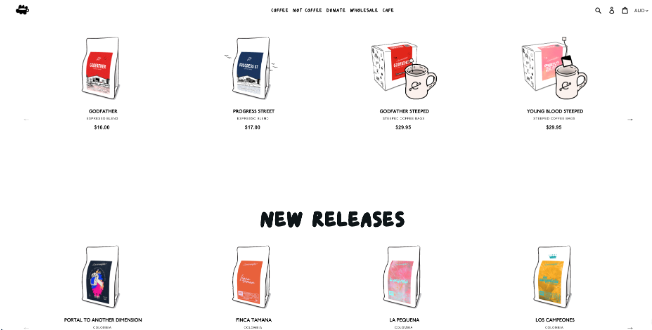
Image source: Commonfolk Coffee
Another reason we love Commonfolk is how they handle their reviews – even the negative ones. They take the time to respond to each one, adding a touch of personality to each one that resonates with their tone of voice.
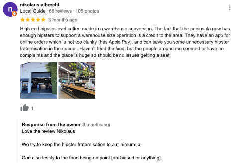
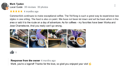
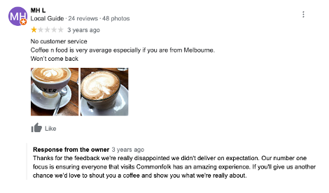
Image source: Commonfolk Coffee Google Reviews
How your brand responds to feedback is crucial, as future customers often use these reviews to gauge your brand offering.
Robert Gordon
What’s the perfect pairing to a cup of Commonfolk Coffee? A hug mug from Robert Gordon Pottery! This Australian brand has been passed down through generations for over forty years.
The brand
Apart from selling beautifully hand-crafted homewares, they have a pottery studio where they run pottery classes for the whole family. Robert Gordon both import and manufacture pottery. They began importing their designs around 20 years ago. However, each imported collection is first designed and developed on-site at their Pakenham headquarters. Despite being a local business, they make 300,000+ pieces and employ 35 locals to do so.
Our favourite things
Their 110k Instagram followers enjoy earthy tones from both designed tiles and their product posts. Their Instagram feed also features useful posts like recipes, behind the scenes and features from magazines they’ve been in.
Below was a post they created with a recipe for a delicious-looking ‘Roasted rhubarb brioche pudding’.
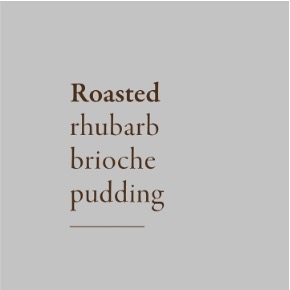


Image source: Robert Gordon Pottery Instagram
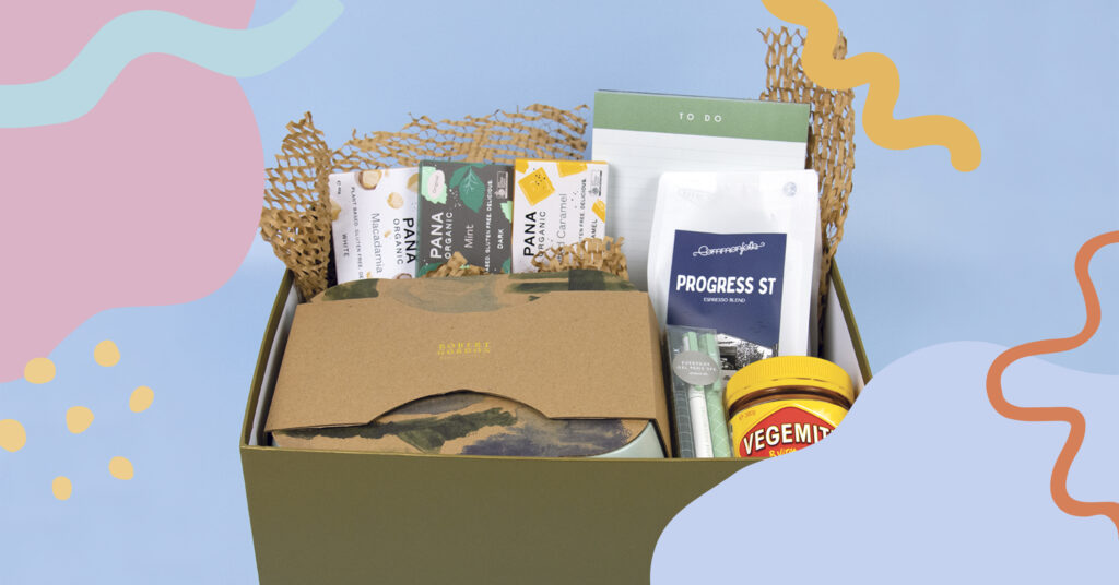
In line with our Branding Bootcamp (and to celebrate our favourite brands), we’re giving away an epic prize pack! Comment on the post below with what it means to have a memorable brand and you will go in the running to win Oraco’s favourite brands’ gift pack! The competition will run from the 4th of July with entries closing at 11.59 pm on 15th July 2022. The winner will be announced on the 20th of July 2022.
While this is by no means an extensive list of brands we love, these are some of the Oraco team’s top few. If you’re looking to get on our list (let’s face it, all our clients are on our top list!) or if you’d simply like some help refreshing or creating your brand, send us an email or DM today.