

Like fashion, logo design trends often evolve to align with the present day. Cultural progressions, political events, societal developments, and technological advancements shape these trends, and brands that don’t take part in the evolution can fall behind and lose credibility.
You may be surprised to find that many major brands change their logo and visual identity as often as every decade. While the change is frequent, we tend to forget their previous logos before the current one. This is often due to the change being very subtle, for example, maintaining the same colour palette and layout, yet updating the font to one that’s more modern. By evolving a logo frequently over time, brands can keep up with current trends while maintaining recognition.
This blog explores logo design trends from the 20th Century onwards, when the first modern logo designs were created alongside mass printing.
Logo design trends from the 50s through to the 80s
While the origin of logo design dates back centuries to ancient family crests, hieroglyphs, and symbolism, the 1950s marked a significant shift in people’s thoughts surrounding logos. Paul Rand’s pictographic IBM logo, featuring a human eye for the letter ‘I’ and a bee for the letter ‘B’ (pictured below), was a turning point for logo design. Brands realised how impactful symbolism could be and started to put a lot of thought into branding their companies.
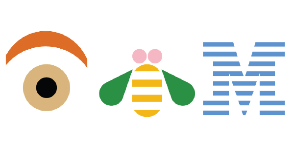
Image source: Google
In the 1960s, Charles Csuri and A. Michael Noll created some of the first computer art, leading the way for computer-generated images (CGI) and computer-aided drawing (CAD) technologies developed in the 1970s. Although, it wasn’t until the 1990s that we saw the popularisation of the personal computer.
Due to limited access to computers and a lack of knowledge of technology, the graphic design process involved manual drawing and cutting and pasting of letters, even as recent as the 80s. It took a steady hand, a good eye and the use of toxic solvents and sharp cutting tools. There was no Ctrl+Z or the ability to change the colour with the click of a button.
So, what was it like before computers?
I asked Kevin Beardsley, Founder and Director of a UK-based design agency, Swoon Marketing, about his experience with technological advancement throughout his career in graphic design.
“Let’s wind back to the 1970s when I started my career in graphic design, way before the revolutionary desktop publishing software and hardware came crashing into our world, under the guise of ‘Apple Macintosh’ computers.
“We used to create all of our design and artwork from the drawing board and other tools, including markers, Rotring pens, compasses, scalpels, cow gum, spray mount adhesive (a hazardous product for your health) and of course the magical Agfa Camera”, Kevin explains.
“We would create marker pen visuals for concept development and customer proofs. Once the client approved this, it was then onto the finished print-ready artwork. Type spec’ing was probably my least favourite part of the job. This was where we had to work out how many words and lines of copy would look good in a certain space. The artwork would then be sent to the litho printer.
“We then awaited our Cromalin proofs. Gloriously crisp and colourful print proofs. These were the ultimate visual of your work before the print was executed”, said Kevin.
Because of this more manual process, logos created before the rise in computer technology were often flat with limited colour. They didn’t have the luxury of using the digital effects that you might see in a logo today. Here are some of the most memorable logos from this time.
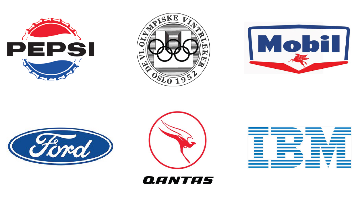 Image source: Google
Logo design trends of the 80s and 90s
Swoon Founder and Director, Kevin, remembers the introduction of the Apple Mac and the internet in 1988.
“This was all unreal. A computer for us to now do our jobs. There was sheer horror at the thought of our creative skills being taken over by a computer. However, after just one week of training on these magical machines, it became clear how much easier and faster our work and projects would become. It was one thing to be able to use these machines, but you still had to be creative”, he said.
“As the years went by, the software became so much more powerful, from Quark Xpress to Adobe InDesign, Illustrator and the immense Photoshop, the digital era had arrived.”
With this came the consumption of more and more media on screens. From unforgettable sitcoms like Friends and Seinfeld to archetypical music videos and movies like Michael Jackson’s Thriller and the Back to the Future franchise.
In the early days of the internet, designers tried to help people adapt to technology by making things on screen look like they were, in fact, off-screen. It brought depth to design and a new trend to ‘make it pop’. By utilising gradients and transparent effects, designers could create 3D forms with textures that were previously not possible.
Using traditional practices with modern ideas, the 80s and 90s brought us a world of fluorescent and pastel colours, along with graffiti and brush-style fonts. Additionally, designers were not shy of creating collages, using squiggly lines, triangles, and zig zags for backgrounds.
While I’m sure this description has painted a clear picture of this burgeoning pop culture scene, most of you are probably quite familiar with it already. Here are some examples that will have you feeling all kinds of nostalgic.
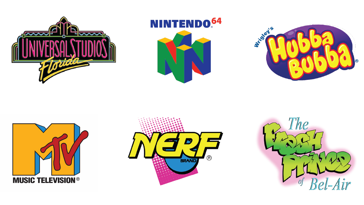 Image source: Google
The Noughties
As the internet evolved, rounded letters, bright colours and multiple gradients became popular within logos. It was no longer necessary to make things look off-screen, as people became comfortable with digital technology.
Minimalism and flat design achieved a more modern, crisp and clean look. We moved away from distracting elements like drop shadows, quirky fonts, and unnecessary graphics or symbols.
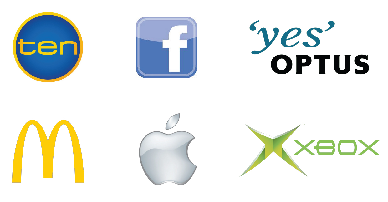 Image source: Google
The 2010s
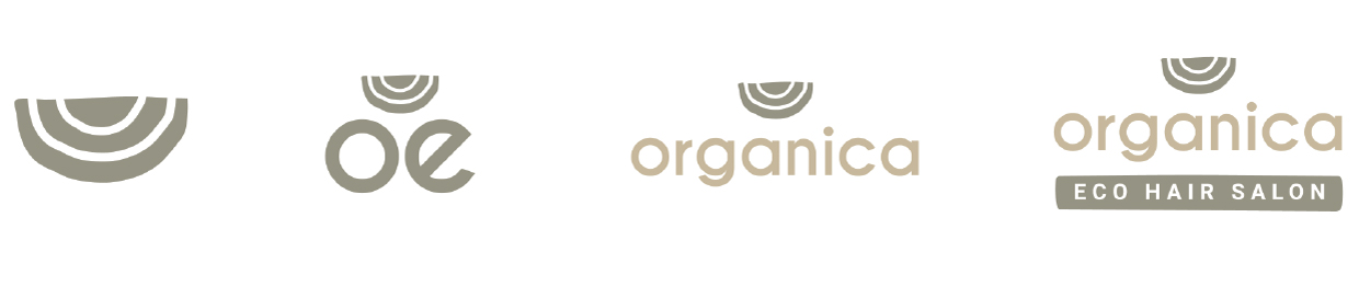
In the 2010s, we saw the rise of social media and other digital channels as key platforms for marketing. This developed a need to embrace logo adaptability, including responsiveness, as smartphones and tablets became popular.
Just like a responsive website, a responsive logo can scale and adapt to wherever your audience sees it. Companies are future-proofing their brand for the ever-changing digital world by having a responsive logo. They have the freedom to explore every channel and maintain visual consistency, which is crucial to brand recognition. The below example demonstrates how a logo can be adapted to be responsive.
From a visual perspective, the 2010s saw more and more logos include:
1. Blurred or distorted text to emphasise fluidity and movement, rather than a focus on legibility alone.
2. Stretched lettering for an infinite, boundaryless look.
3. Illustrated logos that incorporate aesthetics from past decades to generate nostalgia.
4. Layered elements and geometric forms to create a classic look with a twist.
5. Typography reigning in imagery, providing an emblem-like shape and frame for the logo.
The present day
While some of the visual trends we have explored above have been inspired by the past, there are new concepts we must consider surrounding the present day, including consumer behaviour. In a survey conducted in January 2021 by Vrity, 55% of respondents reported paying more attention to a brand’s values than they did the year before, and 60% of respondents reported making a purchase from a brand because their values aligned.
Today, some of the most important values for consumers include innovation, sustainability, human or animal rights, and equality. Without a logo that demonstrates an evolution in line with its values, brands risk losing the loyalty of existing customers and the opportunity to gain new ones.
Your logo is the tip of the iceberg
Let’s pretend your brand is an iceberg; While your brand strategy is the portion of the ‘iceberg’ below the surface, the visible parts above the surface are the tangible aspects of your brand, including colour palette, fonts, and your logo. While you may be keeping up with trends as part of your brand core and strategy, how will your customers know if your brand evolution is not represented visually?
Below are some examples of famous brands that have evolved their logo over time to consider current trends and consumer behaviours.
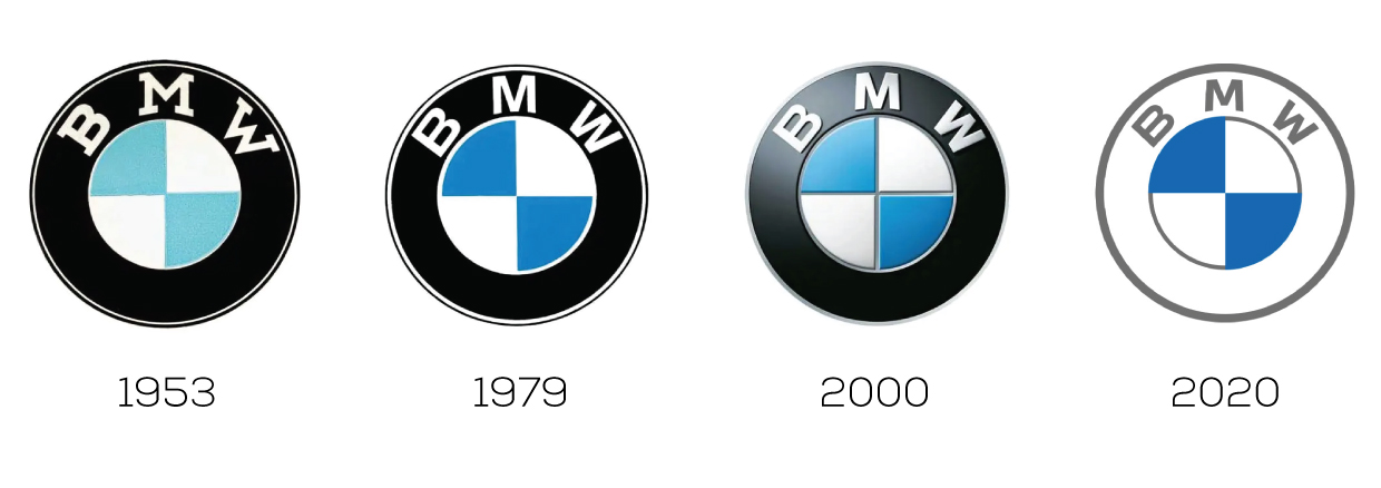
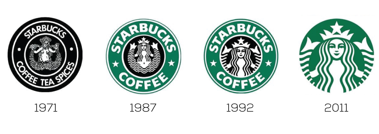
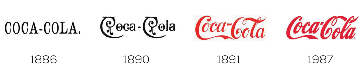
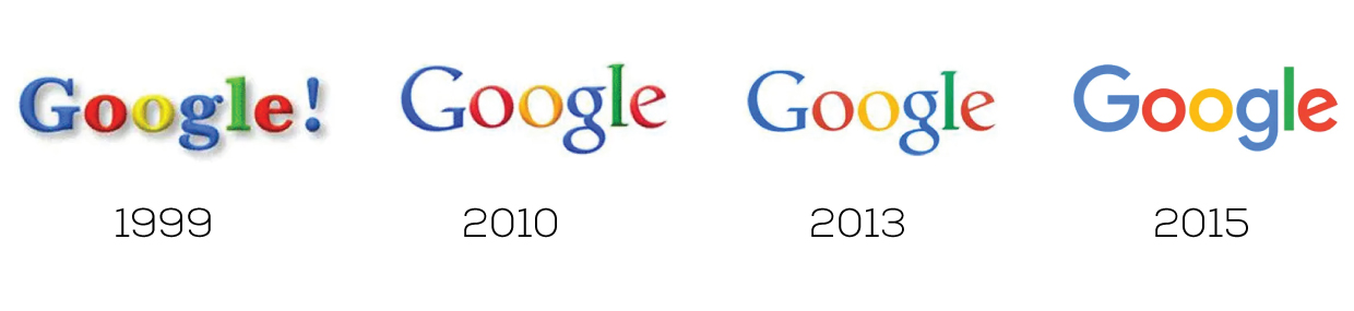
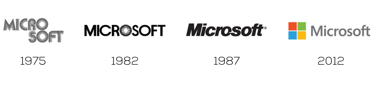 Image source: Google
The general rule of a logo design is to create something unique, simple, and memorable that can be easily adapted and evolve subtly, while maintaining brand recognition.
“The next big thing for the immediate future in graphic design is, of course, digital animation. I wonder how it will continue to evolve over the next ten years and its role in logo design. One thing is for sure – it will be powerful”, Kevin said.
Kevin’s comment opened my eyes to what the future of logo design could look like. As the world of digital technology evolves, designers are inviting people to interact, discover, play, and build their own experiences. Could animation and interactivity be the next big trend and a key consideration in logo design?
If you need help evolving your logo or brand, get in touch with us.




One Response