Often people think that once they have a logo, they have a brand. This is not the case. A brand – including your website design – is your company’s entire identity, from who you are and what you stand for to how you look, sound, and feel. Ultimately, it is how your customers perceive you, and this can be controlled if you put the time into building and nurturing your brand across all touch points.
Consumers connect with brands through associations and experiences with them. A huge part of the customer journey is a brand’s website, with 75% of people first checking out a brand by visiting its website.
So, how can you ensure you build a positive perception and experience with your brand through your website? We’ll guide you through the steps below.
Brand purpose – The who, what, why and how
For a brand to make a good impression, it must be unique, authentic, engaging and above all, consistent. 60% of millennial consumers expect brands to be consistent across various platforms, including their website. This is because inconsistent brand presentation can lead to consumer confusion and a lack of trust.
Brand consistency starts at its core. So, aside from the logo and visual style, which we will touch on later, a brand must be clear on who they are, what they do, why they do it and how they do it.
A consistent brand clearly identifies its:
- Purpose (Why): Vision, mission, and values
- Personality (Who): Characteristics, traits, and tone of voice
- Offering (What): Key messages and language
- Value proposition (How): Key differentiators and uniqueness
Let’s break these concepts down further and explain their role across touch points, like a website.
Purpose (Why)
Your purpose is ‘Why’ your business exists. It’s usually defined as your vision, mission and values.
It is important that your ‘Why’ is communicated to your audience clearly, as 89% of consumers stay loyal to brands that share their values. Your website is a great place to start, being one of the first places consumers visit.
Articulating a brand’s purpose is something that many businesses have trouble doing well, if they do it at all.
While a simple and powerful tagline on a website’s home page is often the most effective way of getting your purpose across, it doesn’t always have to be so literal. There are other ways you can weave these concepts into your content.
Infographics
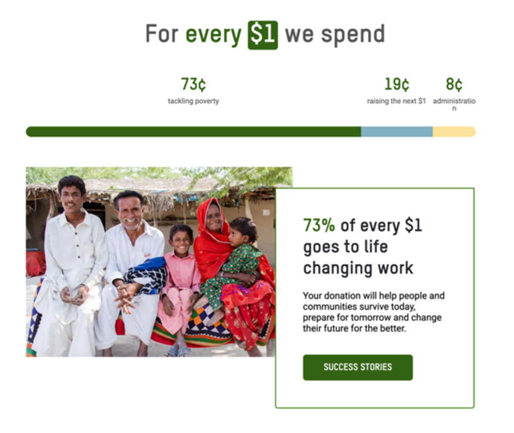
These are a great way to break down information, especially as most of us process visual content 60,000 times faster than text. See the below example from Oxfam. Through a simple infographic, they display the distribution of funds for every dollar donated. This provides the visitor with transparency and, in turn, the brand’s purpose with credibility.

Letter from the founder
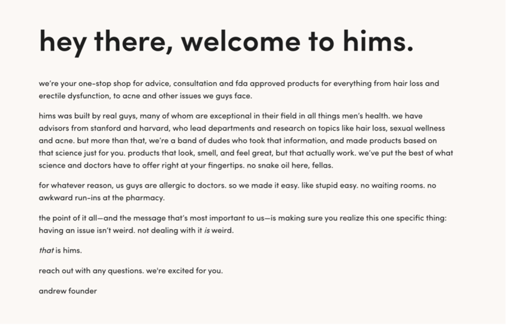
This is a great way to humanise the brand and expand on the brand’s story in a personal way. These letters are often housed on an ‘About’ page; however, it could be a feature on the home page or linked to from a call to action (CTA) button to its own page. See the below example from hims.

Interactive timeline
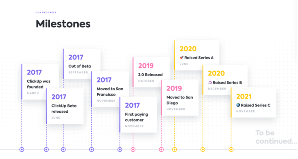
Like a letter from the founder, timelines can provide transparency and offer the visitor an insight into where the brand came from and its story. It’s also visual, like an infographic, so information is processed faster. See the below example from the task management app, Clickup.

About video
Video is the ultimate storytelling content. It can be super impressive and capture your audience through adding motion graphics, captions, audio, voiceovers and more. Including real people adds credibility and can showcase internal culture. is a great example of using both a timeline and video content on their website through a ‘Heritage’ page.
Nike is another brand that always nails storytelling through video content. Here are some of our favourites:
Graphics and imagery
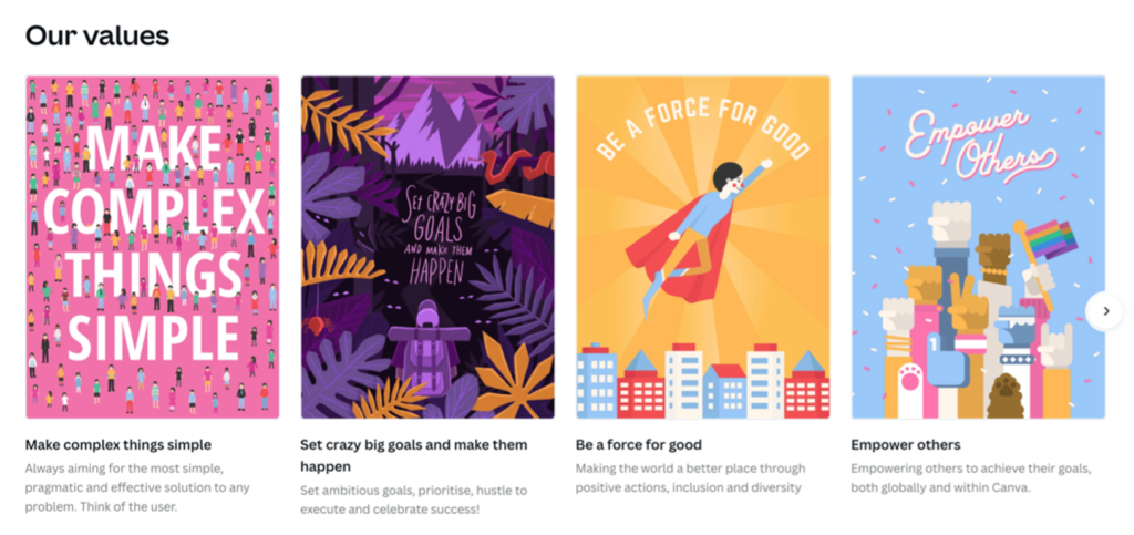
Turning your mission statement or your values into graphics and imagery can really make a statement and create an impact. Canva opted to display their values as short phrases in creative, eye-catching typographic images, and we reckon they’ve nailed it considering their ‘What’ is graphic design!
If you need support defining your ‘Why’, you can find out more in our blog, The Importance of Brand Purpose.

Personality (Who)
In many of the examples above, you will notice that there’s one thing in particular that makes them so impactful – the personality that shines through!
The use of emotive, people-focused imagery from Oxfam, the casual and relatable tone of voice of hims with lines like “no snake oil here, fellas”, and the use of bright colours and quirky emojis in Clickup’s timeline, all showcase brand personality.
Personality can come across in so many ways, from colour, imagery and graphics, to language, tone of voice and even font choice.
Your brand personality tells your audience a lot about your business. For example, if your brand is Nike, your personality might look like this:
- Tone of voice: Motivational, aspirational, entertaining, gritty
- Characteristics: Brave, determined, honest, candid
Offering (What)
While you might have your personality down pat, it’s important that you are communicating what you do and what problem you solve for your customers from the get-go, as ultimately, that’s why your visitors are on your site.
It takes about 50 milliseconds (that’s 0.05 seconds) for users to form an opinion about your website. This determines whether they find your site relevant or not and whether they will stay or leave. 46% of users say that not understanding what a company does is their reason for leaving a website.
Make sure your messaging is short and sharp and communicates what you do and the value you provide your customers.
Unique Value Proposition (How)
Unfortunately, communicating what you do is often not enough for an audience. They want to know why they should choose you over a competitor. What do you do differently? How do you solve their problems and provide them with value?
Try weaving your unique value proposition or UVP into your key messaging. By talking about ‘how’ you do what you do, you will shift your messaging from product-centric to customer-centric.
Sukin nailed their key messaging in the example below by weaving what they do (skincare) with their UVP of being natural, effective, vegan, cruelty free and carbon neutral.
“Natural and effective skincare that’s good for you, your wallet, and the environment too.”
User experience
So, now you know what content you need on your website, but you need to display it in a user-friendly manner.
Strategic user experience (UX) can raise conversion rates by up to 400%, so it’s no secret it can drastically impact the performance of your website.
We’ll take you through the four most important aspects of a website’s functionality and how they can impact user experience.
Website Design
We’re all guilty of skipping through the terms and conditions section when signing up for something. Hey, I get it – you’re time-poor! We all want information to be accessible and delivered fast – websites are no exception.
This is where visual communication in website design comes in. One of the most important parts of website design is breaking up copy and content into easy-to-digest sections. In fact, 38% of users will stop using a website if they think the layout is unattractive. While you might think website design is just pretty colours and fonts, it’s actually about how you communicate information effectively.
Here are some of our favourite ways to break up copy and content with website design:
- Typography: Ensuring a clear hierarchy of text using headings, call to action (CTA) buttons and font colours.
- Iconography: Adding icons to lists to create visual recognition.
- Backgrounds: Breaking up content with section backgrounds of different colours.
- Imagery: Adding imagery next to paragraphs of texts that relate to the subject matter.
75% of a website’s credibility is due to design. Often this is because there is a lack of consistency with the brand identity. Ensure you are using your brand colours, fonts and graphic elements so that users recognise your brand across various platforms.
It’s also important to ensure your logo is one of the first things your visitors see and that it is in a consistent position across every page of your website. That way, the user feels like they are seamlessly navigating the same website.
Mobile optimisation
In 2015, Google announced that it would use mobile-friendly sites as a ranking signal in response to 60% of internet access being from mobile devices. This pushed nearly 85% of all websites to a responsive website design.
Having a mobile-friendly website design is not only crucial for your search engine rankings but also for ensuring you provide your visitors with the best possible user experience. 50% of users say they will abandon a website if it’s not mobile-friendly, making them less likely to engage or revisit a company.
Site Speed
Page load time is one of the most important features of a website for visitors, along with the site’s appearance. If a website takes more than three seconds to load, 54% of visits will be abandoned.
While it’s crucial to grab your audience’s attention through an eye-catching design and engaging key messaging, this is useless if the content is not loading in the first place.
Ensure your website gives your audience the information they need quickly and efficiently. If you find your website is taking longer than three seconds to load, chat with your website hosting or developer to see what you can do to decrease this.
Google PageSpeed Insights is a great tool to test your site speed and performance. It will diagnose performance issues and give you great tips on how to improve them.
Content and information architecture
One of the most important aspects of user experience is delivering your content to the user.
Is your site easy for them to navigate and find the information they need? Is your call to action clear? What do you want visitors to do when they are on your website? Do you want them to give you a call, fill in a form, download a guide, sign up for a mailing list, etc.?
The customer journey throughout your website is important in getting visitors to convert into customers. 62% of users want to access contact information on a homepage, and 86% want to see information on products and services, so it’s important that you deliver relevant content in the least number of steps possible.
We’ve established that there’s a lot to think about when building a website, which will continue to evolve as your business grows.
Your brand will most likely progress with political events, societal developments, and technological advancements, so it’s important that you are building and nurturing your brand presence through one of the very first touch points that your audience will experience on their customer journey.
To find out more about how you can build your website and brand, get in touch with our team, or slide into our Instagram DMs!

