Breaking into the US market isn’t easy, even for big-name brands. It’s crowded, competitive and full of companies trying to Americanise their identity just to get noticed. But Aussie underwear label Bonds did the opposite. They showed up as their full, unfiltered selves – cheeky, bold and proudly Australian. And honestly, it’s a masterclass in how to expand globally without losing your brand soul.
Their new campaign, fronted by Robert Irwin, is grabbing international attention and for all the right reasons. It’s got to be my favourite campaign since Thankyou’s ‘Reimagined’, Nike’s ‘Dream Crazier’ and Medibank’s ‘There are so many ways to live better’ campaigns. Here’s what made it such a smart move.
1. Robert Irwin is the perfect fit
First things first, casting Robert Irwin was a stroke of genius. Not only is he loved here in Australia, but he’s also gained serious global appeal. With over 6.9 million followers on Instagram and regular appearances on US talk shows like The Tonight Show Starring Jimmy Fallon, Robert’s got reach and charm.
He’s the kind of ambassador who feels warm, approachable and down-to-earth. He’s grown up in the public eye, but somehow avoided the usual celebrity ego trap. People trust him. He’s curious, passionate about wildlife and still carries that unmistakable Irwin energy – wholesome, wild and oh, so Aussie.
More importantly, he makes Aussies proud and makes Americans smile. He bridges the gap perfectly.
2. That classic Aussie humour
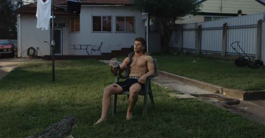
Let’s talk about the ad. It’s as iconic as it is ironic. Robert, sitting confidently in just a pair of Bonds undies, with a python around his neck, a giant spider on his leg, and a crocodile at his feet.
It’s brilliant and it’s exactly what Americans imagine when they think of Australia. But rather than correcting that stereotype, Bonds leaned into it with the punchline:
“How is it, Australians are so laid back?…
It’s simple, they’re all wearing comfy undies.”
It’s that dry, tongue-in-cheek humour we do so well. It takes the wildness of Aussie culture and softens it with relatability. It makes you laugh, but also nod in agreement – comfy undies really do make you feel more chill.
3. A tagline that’s cheeky, clever and kinda iconic
The ad finished with the tagline ‘Made for Down Under’. I mean… come on, it’s genius.
It’s the kind of tagline that makes you do a double take. Yes, it’s a nod to Australia, but it’s also (obviously) referring to the area your undies cover. It’s playful without being tacky and somehow manages to be global while still feeling local.
Taglines like this are rare. Most international brands go for vague or aspirational language that sounds good but means nothing. Bonds nailed something clear, funny and memorable which is what great branding is all about.
4. The Aussie backyard set
The campaign isn’t just about the people or the punchlines, it’s about the scene. And Bonds went full Aussie nostalgia with this one.
We’re talking typical suburban Australia with a plastic sun-faded chair, Bonds singlet hanging on the hills hoist, sprinkler, lawn mower, an old Falcon XB GT (correct me if I’m wrong) in the driveway and a trampoline next door.
For Aussies, it’s instantly recognisable. For Americans, it feels like a quirky, charming peek into another culture. It’s not glammed up or polished, it’s real. And that makes it feel different from every other hyper-produced US ad.
Compare this to campaigns like Fenty Beauty’s global launch, which used multicultural casting and streetwear references to break into new markets. Bonds did the same thing in spirit, but with Aussie cultural cues instead.
5. The launch party was peak cultural immersion
Bonds backed the campaign with a full-blown Aussie-themed launch party at Old Mates Pub in New York – The ‘unofficial Aussie embassy’ as Bonds calls it.
In a world of virtual launches and digital-only rollouts, this tactile, sensory experience is refreshing. It invited people to feel the brand not just see it.
According to HubSpot, experiential marketing increases brand awareness by up to 70% when combined with digital efforts. Bonds clearly got that memo.
6. Extra content that builds the world
What makes this campaign even stronger is the clever suite of supporting content that extends the Bonds universe beyond the hero ad.
We see musician and model Tkay Maidza styled in a pair of Bonds, posing effortlessly next to a broken-down car on a dusty outback road. Tkay was a perfect fit for the Bonds campaign for her representation of modern, diverse Australia. Born in Zimbabwe and raised in Adelaide, she embodies a fresh, global and urban edge that contrasts yet complements Robert Irwin’s iconic Aussie appeal.
Tkay’s effortless style, bold confidence and music career make her a fashion-forward choice, while her inclusion alongside wildlife in the outback adds a fun, cheeky twist that resonates with the campaign’s playful tone.
Behind-the-scenes footage with Robert Irwin added another layer of charm, showing his playful, down-to-earth personality and cracking jokes on set. The cheeky ‘Robert never skips arm day’ video made the rounds online further endearing him to audiences who appreciate the mix of authenticity and humour.
To top it off, Bonds released short reels titled ‘Wild Facts with Robert’, where he dropped fascinating snake facts in that wholesome, passionate Irwin way. This added value content not only gave audiences something to share, it reinforced Bonds’ Aussie identity through storytelling, education and entertainment. These extra touches turned a great ad into an entire experience.
7. The elephant in the room
There’s no denying it, Robert Irwin has certainly grown up, and many of us are still shook! 🔥
For those who remember him as the young boy alongside his father, Steve Irwin, it’s hard to believe how much time has passed. Robert is now a confident, charismatic man, and let’s just say, he’s catching the eye of many!
While his connection to wildlife and his genuine, adventurous spirit have always been his defining traits, it’s impossible to ignore how his new, grown-up look has added an extra layer of appeal. The ad not only taps into his Aussie charm and authentic personality, but it also draws attention to his transformation into someone who’s not just the son of a legend, but a captivating figure in his own right.
His charm is undeniable, and it’s clear that the campaign’s combination of his charisma and cheeky sense of humour has won over not just the younger generation, but those who remember him as a child.
It’s a testament to how Robert is able to tap into both nostalgia and contemporary appeal, all while maintaining the same endearing qualities that have made him a household name.
A note on representation
While the campaign has largely been received with praise, it’s worth asking, does putting 21-year-old Robert Irwin in nothing but undies toe the line of objectification?
Some might say yes. At just 21, and known for his wholesome, conservationist image, seeing Robert stripped down could feel jarring or overly commodified. It raises valid questions about how youth and celebrity are commercialised, and whether gender really changes how we view objectification in advertising.
But here’s the nuance. The tone of the ad matters. It’s playful, self-aware and unmistakably tongue-in-cheek. Robert isn’t portrayed in a hyper-sexualised or vulnerable way. He’s in on the joke. The scene feels more like a humorous nod to Aussie stereotypes than a thirst trap.
In a world where male objectification in media is still under-discussed, it’s a reminder that all representation deserves scrutiny, but context, consent and tone play a huge role. Ultimately, the ad feels less like exploitation and more like a clever celebration of both comfort and character.
How Bonds got the global playbook right
So many brands try to break into the US market by softening their identity. Accents get neutralised. Taglines get changed. Colour palettes get tweaked. But Bonds? They doubled down on who they are.
Here’s why it worked:
- They didn’t shy away from being Aussie. They made it their selling point.
- They found humour that translated globally, without losing nuance.
- They used a cultural ambassador who connected across borders.
- They created a whole experience, not just a product push.
It’s the same blueprint brands like Tim Tam or Vegemite have tried in the US, but never really nailed. Bonds brought clarity, confidence and character to the table and that’s why they basically broke the internet this weekend.
Final thoughts
Bonds’ US campaign is a reminder that the most powerful branding tool you have is your identity. Not your budget, not your reach, just your ability to show up as yourself and make people feel something.
By staying proudly Aussie, embracing visual humour, and choosing an ambassador who’s loved across borders, Bonds didn’t just launch a product, they launched a personality.
Let us know what you think about the launch in the comments below.
Image Source: Bonds Australia