In a world where brands strive to be more inclusive and forward-thinking, accessibility is often overlooked. But forward-thinking brands are beginning to change that.
Take Coles Group, for example. In 2024, it was ranked number one in Australia’s Access and Inclusion Index, recognised for its efforts in improving accessibility across its stores and services. This achievement highlights how prioritising accessibility isn’t just a moral choice – it’s a business decision that builds trust and inclusivity.
Accessibility is a fundamental part of design and communication. If you’re serious about creating a brand that doesn’t just say it cares but shows it does, accessibility needs to be part of your brand identity from day one. Here’s why.
1. Inclusion
We’re talking about more than just ticking boxes. According to the World Health Organization (WHO), one in six people worldwide has a significant disability (including physical, sensory, cognitive and chronic conditions). That’s over 1.3 billion people – a market segment no brand can afford to ignore. This statistic also doesn’t include those who live with temporary, situational or age-related impairments. Have you ever broken an arm or forgotten your glasses?
Excluding these individuals isn’t just a moral failure, it’s a missed opportunity for connection. Brands that prioritise accessibility show their audience that they care. No one likes feeling left out, especially when engaging with a brand that’s supposed to understand them.
2. Customer Loyalty
Brand loyalty doesn’t come from marketing campaigns or a one-time clever tagline. It’s built on consistent, positive experiences. If your website, products, or services are inaccessible, you’re creating barriers that prevent potential customers from engaging with your brand.
According to a study by Click-Away Pound (2019), 71% of disabled people with access needs will leave a website that they find difficult to use, and 82% of these customers would spend more money if websites were more accessible.
Accessibility means ensuring that people with various abilities can easily interact with your brand. That could mean a website that’s screen-reader friendly, content that’s colourblind-inclusive, or videos with captions. Nail these elements, and you make it effortless for more people to engage, building long-term customer loyalty.
3. Legal Requirements
Accessibility is increasingly becoming a legal requirement. In Australia, several legal frameworks and guidelines mandate accessibility standards to ensure equal access for individuals with disabilities. Key regulations include:
- Disability Discrimination Act 1992 (DDA): The DDA prohibits discrimination against people with disabilities in various areas, including employment, education, and the provision of goods and services. It requires that public and private organisations make reasonable adjustments to accommodate individuals with disabilities. This act has been interpreted to apply to digital platforms, necessitating that websites and mobile applications be accessible to all users.
- Australian Standard AS EN 301 549: This standard outlines the accessibility requirements for ICT products and services, aligning with international standards to ensure digital inclusivity. It specifies the technical and functional requirements for web accessibility, including conformance to Web Content Accessibility Guidelines (WCAG) 2.1 Level AA.
- Australian Government’s Web Accessibility National Transition Strategy (NTS): The NTS mandates that all Australian Government websites meet WCAG 2.2 Level AA standards, aiming for a more inclusive digital environment.
These regulations collectively ensure that digital platforms in Australia are accessible, promoting equal participation for individuals with disabilities.
The Potential Legal Risks
There has been a notable increase in accessibility lawsuits in recent years. Several high-profile cases and growing awareness of digital accessibility have contributed to this trend.
For instance, in 2014, a blind woman named Gisele Mesnage filed a lawsuit against Coles, alleging that the supermarket chain had discriminated against her because of her disability. She encountered several accessibility errors while trying to place a grocery order on Coles’ website, including being unable to select a delivery time and complex navigation that meant it could take up to eight hours to place an order. The case was settled out of court and was the first web accessibility lawsuit to reach the Australian Federal Circuit Court.
Given the increasing awareness and legal actions related to digital accessibility, organisations in Australia are encouraged to ensure their digital platforms comply with the DDA to avoid potential legal and reputational risks.
4. Good Design
Accessible design is just good design. When you make your content clearer, your interfaces simpler, and your visuals easier to process, everyone benefits.
Think larger buttons, high-contrast colours, readable fonts and straightforward navigation. These aren’t just helpful for those with disabilities, they help anyone scrolling through your site on a sunny day, in a rush or after a late night out.
According to a Nielsen Norman Group study, improving readability and usability for users with disabilities often enhances the user experience for everyone. Accessible design reduces cognitive load, streamlines navigation and increases overall satisfaction.
Better design means a better experience and a better experience means a stronger brand.
5. Market Opportunity
Brands often focus on growth markets, but they forget that people with disabilities represent an enormous untapped market. Globally, the spending power of disabled consumers is estimated to be over $8 trillion. While there are limited statistics on the Australian market, in the U.S. alone, people with disabilities have $490 billion in disposable income.
If you’re not creating accessible products and services, you’re ignoring a consumer base with significant purchasing power. Worse, you could be inadvertently signalling that they’re not welcome – a reputation killer in a world where brand values matter more than ever.
6. SEO Benefits
Search engines, like Google and Bing, love accessibility. Websites designed with accessibility in mind tend to perform better in search engine optimisation (SEO). Features like descriptive alt text for images, clear heading tags, and logical site structures help search engines understand your content better – boosting your rankings.
For example, Google’s algorithms favour websites that are easy to navigate and understand. Accessible websites tick these boxes because they follow best practices for clear communication. Better SEO means more visibility, more traffic, and ultimately, more conversions.
7. Staying Ahead of Competitors
The truth is, some brands are already ahead of the curve. Companies like Microsoft, Apple, and Google have made accessibility a core part of their brand ethos.
Microsoft, for example, has developed an entire suite of accessibility tools and even launched the Inclusive Design Toolkit to help other businesses follow suit.
If your competitors are prioritising accessibility and you’re not, you’re handing them an advantage. In a competitive market, that’s a risk you can’t afford to take.

Practical Steps for Businesses
If you’re looking to integrate accessibility into your strategy, you can start by:
- Conducting an accessibility audit to identify gaps and areas for improvement.
- Training teams on inclusive design principles to ensure accessibility is embedded in workflows.
- Implementing user testing with people who have disabilities to gain real-world insights.
- Update your website and digital content to meet WCAG standards. While not a law, the Australian Human Rights Commission recommends that organisations adhere to WCAG 2.0 Level AA standards to meet the accessibility requirements of the Disability Discrimination Act (DDA). These guidelines provide a framework for making web content more accessible to people with disabilities.
- Enhancing physical spaces with accessible layouts and clear signage.
- Providing alternative formats for content, such as transcripts for audio and braille options for printed materials.
By making these changes, businesses can create a more inclusive experience that benefits everyone. Here are some businesses doing this well.
ANZ Bank has implemented accessible banking initiatives, including screen-reader-friendly websites, voice-activated ATMs, and Easy Read banking guides to support customers with disabilities.
ABC (Australian Broadcasting Corporation) has committed to captioning 100% of its television content and providing audio descriptions for visually impaired audiences.
Accessibility Tools
There are plenty of tools and frameworks to help you get started, including:
Online:
- Web Content Accessibility Guidelines (WCAG): As mentioned above, these are guidelines for building accessible websites, including a set of standards (like font sizes, colour contrast, and navigability) that are useful for both online and offline materials.
- WAVE (Web Accessibility Evaluation Tool): A browser extension that provides visual feedback about the accessibility of web content by identifying errors such as missing alt text, contrast issues and structural problems.
- Axe Accessibility Checker: A browser extension that automatically checks for accessibility issues, making it easier to audit your website for compliance with WCAG (Web Content Accessibility Guidelines).
- Lighthouse (by Google): A tool integrated into Chrome DevTools that provides audits for performance, SEO, accessibility and more.
- AccessiBe: A tool that adds an AI-powered accessibility widget to websites, offering features like text-to-speech, contrast adjustments and keyboard navigation aids.
- UserWay: An accessibility widget that helps meet WCAG and ADA compliance requirements by offering various website accessibility features like font resizing, screen reader functionality, and more. See an example of the widget in use by selecting the violet button in the bottom left corner of our website.
- Color Oracle:A free colour-blindness simulator that helps businesses test the colour contrast of their designs to ensure accessibility for users with different types of colour blindness.
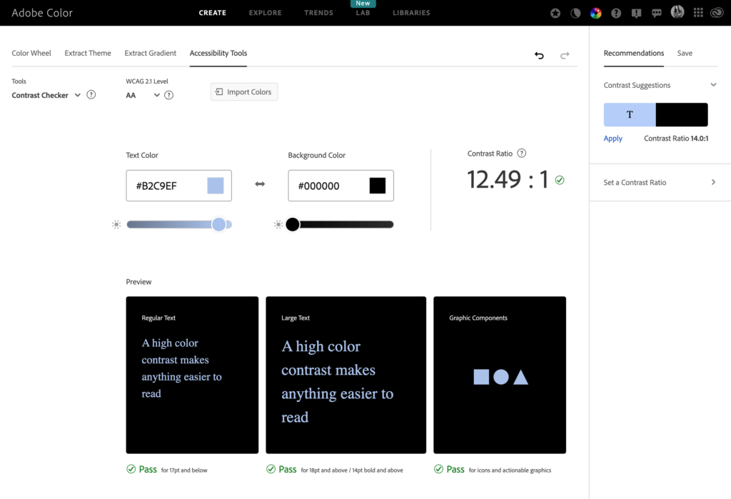
- Adobe Color: As well as measuring whether colours are colour blind safe, Adobe Color’s accessibility tools help designers check the colour contrast of their designs in relation to regular text, large text and graphic components.
- Grammarly: Ensures that written content is clear and free from errors that could affect understanding, helping with readability and language accessibility.
Offline:
- Voice Dictation: Voice-to-text software, like Google Dictate or Apple’s Dictation, can help make offline materials more accessible, especially for individuals who are unable to use a keyboard.
- Text-to-speech (TTS) software: Software like NaturalReader or Balabolka can read aloud any text for those with visual impairments or reading difficulties.
- Braille printers: Businesses creating printed materials for people with vision impairments can use Braille printers to convert documents into Braille.
- Audio descriptions for video and presentations: Adding audio descriptions to offline media, such as videos or presentations, ensure that individuals with visual impairments can understand the content.
- Assistive listening systems: Systems like hearing loops or FM systems provide accessibility for individuals with hearing impairments in public spaces, meeting rooms, or events.
- Textured signage: Businesses can use tactile or raised text and Braille on signs to ensure individuals with vision impairments can easily navigate physical spaces.
- Readable fonts and clear layouts: Using large, legible fonts, high-contrast colours and clear layouts in printed materials or signage makes information accessible to a broader audience, including those with dyslexia or visual impairments.
General:
- Universal Design Principles: Implementing universal design principles for both online and offline environments ensures that all spaces, whether digital or physical, are accessible to everyone, regardless of ability.
- Microsoft Accessibility Checker: Part of Microsoft Office app.
Accessibility Shouldn’t Be an Afterthought
Ultimately, creating an accessible brand isn’t about doing the bare minimum. It’s about embracing a mindset that ensures your brand is for everyone. Challenge old norms that left people behind and build something that truly reflects the diverse world we live in.