Design isn’t just about making things look pretty. It’s a delicate balance of form, function and psychology that creates experiences that stick with people long after they’ve scrolled, clicked or walked away.
Behind every jaw-dropping design are design principles. Rules, frameworks and guidelines that guide the creative process.
If you’re a brand looking to captivate your audience, understanding design principles is essential. It’s backed by more science than you might think.
So, let’s explore the core design principles that every brand should know.
1. Balance
Balance in design is like seasoning in cooking. You might not notice it when it’s right, but you’ll definitely notice when it’s off. Balance creates visual stability and harmony, ensuring that no single element overwhelms the others. There are three types of balance:
- Symmetrical Balance: Like a mirror image, it creates a sense of order and reliability (think Apple’s minimalist aesthetic).
- Asymmetrical Balance: More dynamic and modern, it uses different elements of varying weight to achieve equilibrium (Nike ads).
- Radial Balance: Elements radiate from a central point, like the petals of a flower or the spokes of a wheel.
For example, when designing a website homepage, you could use symmetrical balance for a professional, structured look. For a bold, creative campaign, you might experiment with asymmetrical balance to create energy and movement.
A Journal of Marketing Research study found that balanced designs are perceived as more aesthetically pleasing and trustworthy. And trust is the foundation of brand loyalty.
2. Emphasis
Emphasis helps highlight the most important part of your design, guiding viewers to focus on what matters most. This can be achieved through size, colour, shape or placement.
For example, in an ad, the headline or call-to-action (CTA) should stand out. Use bright, bold colours for CTAs and limit competing visual elements to draw attention directly to your key message.
A study by HubSpot found that emphasised CTAs improved conversion rates by 28%. Without emphasis, your design risks becoming a confusing mess where nothing stands out.
3. Contrast
Contrast is the secret weapon that helps important elements stand out. Whether it’s contrasting colours, fonts or sizes, the goal is to guide the viewer’s eye to the most crucial part of the design.
High-contrast designs are not just visually appealing, they’re also essential for accessibility. According to the Web Content Accessibility Guidelines (WCAG), text and backgrounds should have a contrast ratio of at least 4.5:1 to ensure readability for people with visual impairments. Websites that nail this tend to have lower bounce rates and higher engagement.
A study by HubSpot found that calls-to-action (CTAs) with high-contrast buttons increased conversion rates by 21%.
4. Hierarchy
Good design tells a story, and hierarchy is the plot structure. It helps viewers know what to look at first, second and third. Hierarchy is achieved through:
- Size: The biggest element is usually the most important.
- Colour: Bright, bold colours naturally draw the eye.
- Placement: Elements at the top or centre of a design often get priority.
A study by NN/g Nielsen Norman Group showed that users typically read in an F-shaped or Z-shaped pattern on digital screens. Smart designers use this knowledge to place key information where eyes naturally land.
If your design lacks hierarchy, it will be confusing, directionless and forgettable.
5. Repetition
Repetition creates familiarity, and familiarity breeds comfort. Consistent use of colours, fonts, icons and spacing reinforces your brand identity and makes your designs instantly recognisable.
Think of Coca-Cola’s use of red and white or McDonald’s golden arches. These brands have repeated their visual elements so consistently that they’re etched into our collective brains.
Research by Lucidpress found that consistent branding can increase revenue by up to 23%. Therefore, a clear style guide is essential to ensure your team consistently applies colours, typography and design elements across all platforms.
6. Rhythm
Rhythm is about creating a sense of movement and flow through repeated patterns or elements. Just like in music, rhythm in design can be fast, slow or steady, depending on the effect you want to create.
For example, alternating images and text in a consistent pattern can guide the viewer’s eye smoothly through the design. According to Adobe’s Creative Trends Report, designs with a clear rhythm and flow improve user engagement by 40%.
Using alternating image and text blocks in web design can create a natural flow that encourages users to keep scrolling.
7. Proximity
Proximity is all about grouping related elements to create a sense of organisation. It helps users quickly understand which pieces of information belong together.
For example, on a website, contact details should be grouped in one area (usually the footer), while navigation links should be at the top. This makes the experience intuitive and frustration-free.
The Gestalt Law of Proximity explains that clear proximity and grouping can reduce cognitive load. It suggests that elements placed near each other are perceived as related, aiding users in processing information more efficiently. Minimising cognitive load is crucial for usability. When users expend less mental effort navigating a site, they’re more likely to complete tasks successfully.
8. Alignment
Alignment ensures that all elements in your design have a visual connection. Whether it’s left-aligned text, centred headings or grid-based layouts, alignment creates order and polish.
Misaligned elements create visual tension, and not in an edgy, artistic way. According to Adobe’s UX Trends Report, designs with strong alignment are 60% more likely to be described as professional and credible by users.
Ensure you use grid systems to align text, images and spacing for a cleaner, more organised layout.
9. Whitespace
Whitespace (or negative space) is the empty space between design elements. It gives your content room to breathe and makes everything feel more elegant and intentional.
Brands that master whitespace, like Apple and Google, create an immediate sense of clarity and sophistication. A study by Human Factors International found that increasing whitespace by 20% around text blocks improved comprehension by 30%.
Don’t be afraid of empty space. Use it to frame key messages and give visuals greater impact.
10. Unity
Unity (or harmony) ensures that all the design elements work together cohesively to create a consistent, unified message. When everything aligns visually and conceptually, the design feels complete and intentional.
Without unity, even the most beautiful elements can feel disconnected. Research indicates that design elements promoting unity and harmony can enhance user engagement and memory retention. The principles of unity and harmony in design contribute to a cohesive and visually appealing experience, aiding in the viewer’s understanding and recall.
Enhancing Design Principles with Colour Theory
Colour plays a pivotal role in design, influencing both visual impact and emotional response. If design is the language, colour is the tone of voice.
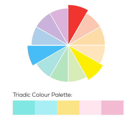
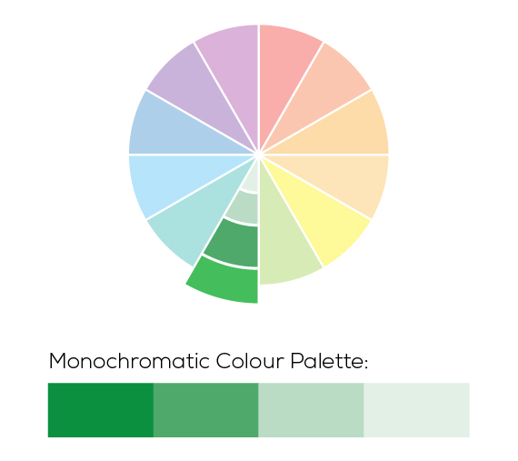
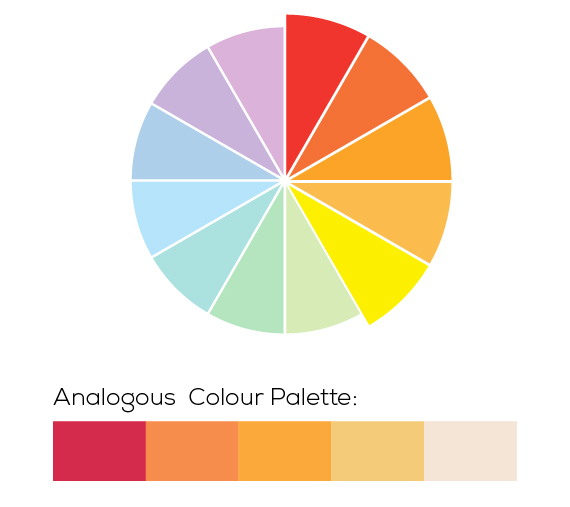
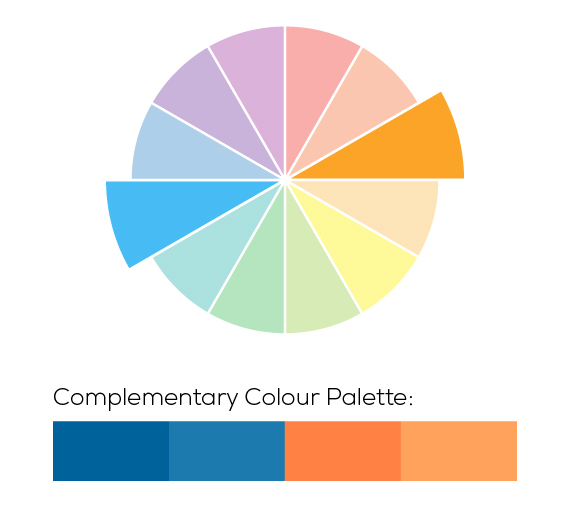
Understanding colour theory helps designers combine hues effectively, ensuring balance, contrast and harmony. By using concepts like complementary or analogous colour schemes, you can create designs that are both visually striking and cohesive.
This understanding becomes even more powerful when paired with colour psychology, where specific colours evoke emotions or shape perceptions. A crucial tool for building brand identity and influencing audience behaviour.
Harnessing Emotion with Colour Psychology
Colour psychology is the study of how colours influence human emotions, perceptions and behaviours. In marketing and branding, it explores how different colours can evoke specific feelings or responses, such as trust, excitement or calm. For example, blue is often associated with trust and professionalism, while red can evoke energy and urgency.
By understanding these associations, businesses can strategically use colour to impact consumer decisions, enhance brand identity, and create more engaging and memorable experiences.
According to Colorcom, 84.7% of consumers cite colour as the primary reason they buy a product.
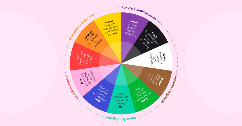
So what emotions do each colour evoke?
- Red: Passion, energy, urgency (Coca-Cola, Target.)
- Blue: Trust, calm, professionalism (Facebook, LinkedIn)
- Yellow: Optimism, warmth, attention (McDonald’s)
- Green: Growth, health, sustainability (Spotify)
- Black: Sophistication, luxury, authority (Chanel)
- Orange: Creativity, enthusiasm, friendliness (Fanta)
- Purple: Luxury, creativity, spirituality (Cadbury’s, Hallmark)
- Pink: Femininity, playfulness, compassion (Barbie)
- Brown: Stability, warmth, reliability (M&M’s)
- White: Simplicity, purity, peace (Apple)
- Grey: Neutrality, balance, professionalism (Mercedes-Benz)
- Gold: Prestige, elegance, luxury (Rolex)
- Silver: Modernity, technology, sophistication (Tesla)
Your brand’s colours are shaping perceptions whether you realise it or not. So, when you’re selecting your brand colours or designing your next marketing campaign, make sure you think about the emotions they may be evoking.
Designing for Impact
Great design is a blend of art, science and psychology. When you balance elements, use contrast wisely, create hierarchy, and consider colour psychology, you’re crafting experiences that resonate, convert, and, most importantly, stick.
Do you need support selecting your brand colours? Get in touch with us.