

A picture might tell a thousand words, but a thousand words can paint a damn good picture, too! The power of words is apparent in every piece of copy you write for your website. Good copywriting can create conversions – whether it’s a product or service sale, newsletter signup, or social media follow – and entertain your audience.
Here are some of our top tips for creating (and nailing) copy that your consumers will love.
Finding your tone of voice
First things first – you need to define your brand’s tone of voice (TOV). Semrush defines a business’s tone of voice as, ‘How a brand communicates and connects with its audience through messaging and customer interactions.’
A consistent tone of voice helps businesses differentiate themselves from the competition and communicate their brand values to their audience. It will be present across all communication platforms and help identify and characterise your brand.
One example of a great tone of voice is one of Oraco’s favourite brands – Who Gives a Crap – whose copy is full of puns and quick-wit. This is consistent across their website, social channels, EDMS, packaging, and wherever their brand is present.
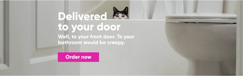
Source: WGAC Website
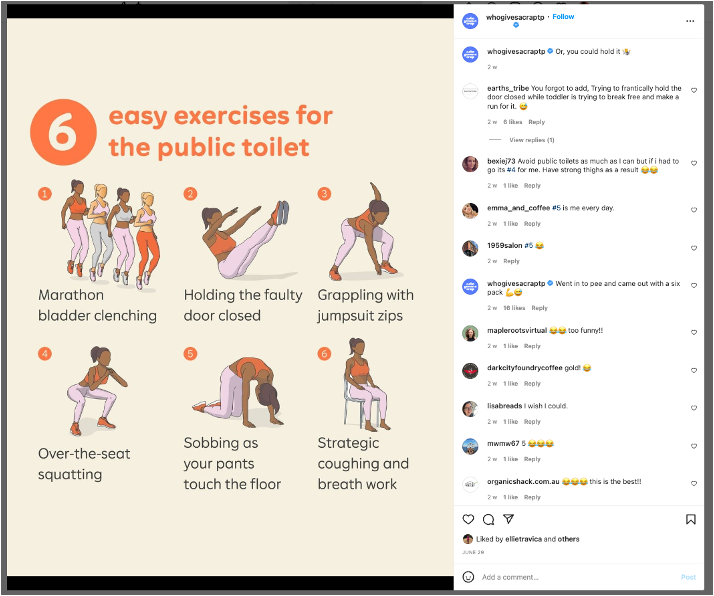
Source: WGAC Instagram
The spelling and grammar police
You’re only human, which means it’s almost impossible to avoid spelling and grammar mistakes in copywriting. However, copyediting is a crucial part of the copywriting process. Carefully scrutinising your work for grammatical errors should be part of your process. Getting someone else to help edit your work is a great idea, as many people find it hard to proofread their own work. Installing tools such as the Grammarly plug-in will help you to identify mistakes as you type.
Your tone of voice will also determine how you write and the language conventions you use. Using Who Gives a Crap as an example – their language is casual and friendly, so using big words and complicated sentences wouldn’t be on-brand for them. On the flip side, it would be out of place for a company with a serious tone of voice (such as a law firm, etc.) to use things like puns and slang in their copy.
Although you’re going to make spelling and grammar mistakes from time to time, quality needs to be your main priority. Errors in your work will only show carelessness and lack of revision.
Reel them in
How often have you read something and skipped over it because it didn’t sound interesting? Unfortunately, not having a good or catchy ‘hook’ can cost you. You may have written a great article, blog or social media caption, but readers might not make it past the first sentence without a catchy introduction. Below is an example of a blog introduction written by Frank Body. Let’s just say we’re hooked! It’s short, sharp, interesting and, above all – relatable. It only takes a few seconds to make a good first impression – make sure that yours is a memorable one!
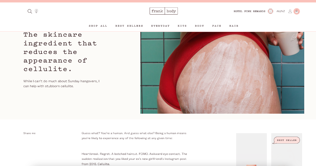
Source: Frank Body
Avoid copywriting jargon and hyperbole
Let’s face it – writing is hard. If you’re sitting there wracking your brains about how to write a solid piece, it’s only natural that you’ll want to slither back into something you’re more comfortable with – especially if writing isn’t your 9 to 5! Defaulting to language that you know is dangerous territory. Regardless of your industry, it’s hard to write neutrally. However, this is extremely important. Things that come easily to you might not make sense to your target audience. For example, if you were working as a lawyer, using legal jargon throughout your copy might make you sound like you know what you’re doing (because let’s face it – you do!), but your target audience aren’t lawyers – they’re likely everyday citizens that have no idea what you’re trying to say. If it’s not something you’d say in a conversation with a friend, try and look for an alternative,
Make them feel
Now, THIS one’s important. You’re writing for people – NOT for Google! While there are plenty of aspects Google looks for when ranking your site (this is a whoooole other thing!), the most crucial aspect is writing for your audience. You want to invite them in with good copy. You want to make them feel. Off the back of that, you need to consider how you want them to feel. Are you trying to make them happy? Scared? Wanting to take action? People prefer conversations – it’s why the blog introduction above from Frank Body was so effective. It felt like a conversation between friends rather than a post about cellulite. A good writer can make a piece of writing feel like a conversation rather than a lecture.
Find your go-to copywriting phrases and get rid of them
We all have them — those words or phrases we love and constantly repeat throughout our writing. Often you won’t notice yours until someone points it out. Even then, they’ll still manage to creep in. Our advice? Get someone to proof your work – whether it’s a copy editor or your mum’s best friend – and ask them to make a note of words or phrases that stand out. Some other things to check your work for include words and phrases that don’t add any value to the sentence (and create unnecessary padding). These include:
- Actually
- Really
- Very
- Just
- For the most part
- Per se
- Due to the fact that
- The point is
- As mentioned previously
The list goes on. A good way to tell if a word or phrase is unnecessary is to remove it and see if your sentence still makes sense. When in doubt, take it out!
Play with puns, alliteration and rhyming
Lastly – and probably one of my favourite things – is playing with puns, alliteration and rhyming. These are great ways to get quirky with your copywriting and engage your audience. Here are a few of our favourite examples.
Puns and play on words in copywriting
If you want an idea of solid ‘punny’ copy, head to the Who Gives a Crap website, socials or anything their writing touches. They (literally) use toilet humour across their copywriting, and as a toilet paper company, it works perfectly. Another example of a company that uses a play on words is Sukin. Their slogan, “Because, beauty shouldn’t cost the earth”, has a double meaning. First, they’re referring to price. Natural beauty products (which are often expensive) should be reasonably priced to be more accessible to everyone. Secondly, they are talking about literally costing the earth. Using products that aren’t natural is costing us our earth and its health.
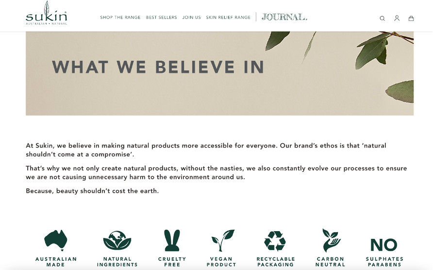
Source: Sukin
Rhyming in copywriting
Ahh, yes. We love a good rhyme here at Oraco – whether it’s subtle or in your face. One of the most famous examples comes from Heinz – “Beanz Meanz Heinz”.
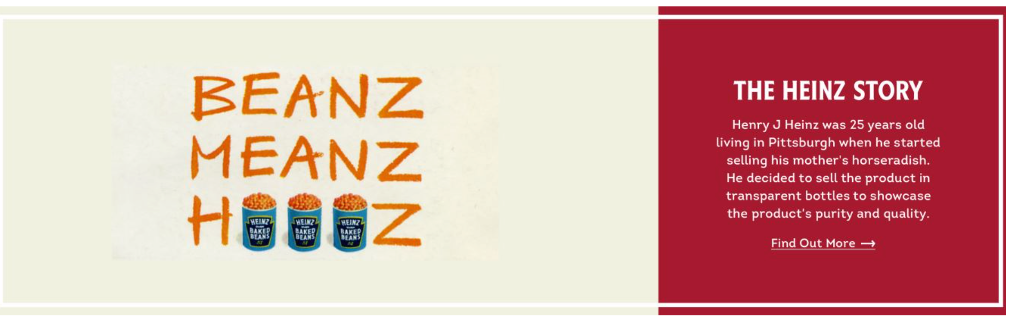
Source: Heinz
Although we know that “Heinz” and “beans” don’t technically rhyme, it’s a fun slogan that most people would know. Another company who have used rhyming throughout their copy are pup subscription company, BarkBox. “No muss, no fuss, no disappointed pups” is a fun way they engage their audience.
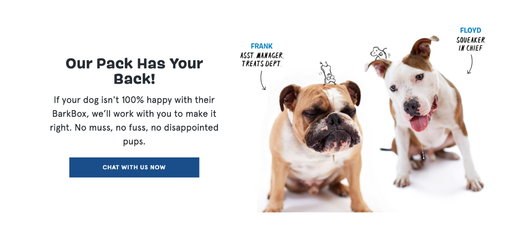
Source: BarkBox
Alliteration in copywriting
Lastly, alliteration can be an effective way to grab your audience’s attention. There’s a reason why company names like “Coca-Cola”, “Krispy Kreme”, and “TikTok” are so easy to remember! The same-sounding letter works like rhyming does and makes it stick in your audience’s mind. Another use of alliteration is in social media captions like Cotton On Body have used in some of their posts.
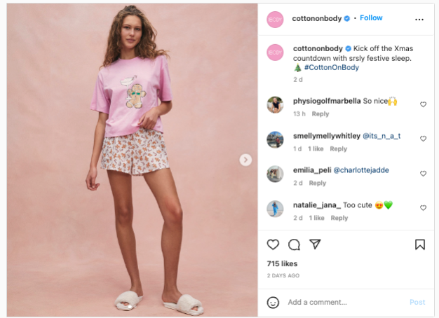
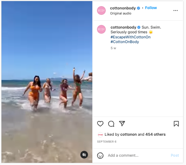
Source: Cotton On Body Instagram
Copywriting is the only thing that works as a 24/7 salesperson for your business. Let that sink in. Ensuring your copy is up to scratch across all platforms is more important than you think (you never know who will be doing a cheeky 3 am scroll!). For copywriting that will knock your socks off or words that wow, get in touch with the experts at Oraco to begin your copywriting journey today.
*P.S. Yes, we know the difference between your and you’re!





One Response