Having a cohesive social feed is more than just a collection of ‘pretty pictures’. It is an extension of your brand and should demonstrate your brand’s aesthetic, tone of voice and brand values. Your social feed should give your audience a sense of who you are and what you have to offer through a collection of engaging, strategic and educational content.
A strong visual identity on social media can help capture your target audience, strengthen your brand and be the difference between converting a visitor to a follower.
A few quick tips
Before we dive into the ‘how to’ of creating a cohesive social feed, there are a couple of fundamental things that you need first. Having a clear brand style guide is important when it comes to brand consistency and application. A brand style guide is a detailed document that defines your brand identity and how your brand is represented across applications. It’s a document that identifies your brand colours, typography, logo variations, your brand personality and tone of voice. Without a clear brand style guide, you could find yourself posting content that doesn’t best represent your brand and its values.
Another important fundamental you will need before we get started is a strong strategy behind the content you want to post. It’s all good and well to create ‘pretty’ looking content, but without apparent reason and strategy behind it, the messaging could get lost in translation, and you could lose engagement from your audience. Understanding the ‘why’ and ‘who’ of your content will lead to success and building your brand community.
For more information on what a social media strategy is, check out this blog or reach out.
Alright, now we are ready to dive into creating a cohesive social media feed. Check out some of our top tips below:
1. Choose the right profile image
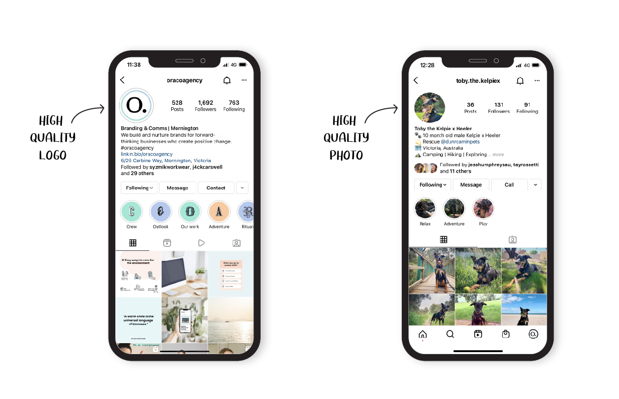
Your Instagram profile image should be easily recognisable – even on a mobile device. Regardless of whether you choose to use a logo or photo, it’s important you’re using a clear, high-quality file.
Here are some points to consider when choosing your profile image:
- Simplicity is key – if your logo is hard to read, consider using a sub mark of your brand.
- Use high contrast
- Be aware of cropping
- Choose an image that will stand the test of time
While your Instagram profile image is a small aspect of your feed, it holds much importance. Your profile image is there to capture your audience and represent your brand in a split second.

2. Define your brand colours
Choosing the right colour palette can set the tone for your feed. You need to make sure that the colours you choose match your brand identity and visually communicate the mood and tone of your brand (this is where your brand style guide comes into play).
Some key notes to keep in mind when choosing your colours:
- Select 1-2 primary colours – these are the main brand colours from your style guide
- Select 1-2 secondary colours to elevate your brand and enable you to be more playful in a social environment
- Always pay attention to the colours in your photos – you can tie photos in with your designed tiles through complementary colours
3. Define your brand fonts
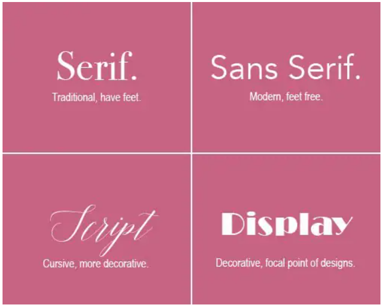
Much like your colour palette, the fonts you use help set the tone and personality of your brand. There are lots of different types of fonts out there, but they can be split into the following main categories (Serif, Sans Serif, Script and Display).

Image source: Adobe
When choosing a complementary font for your social media, here are a couple of things to consider:
- What personality do I want to portray? (traditional, modern, playful)
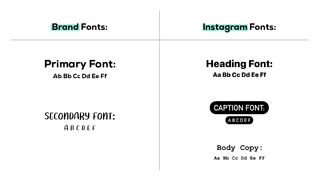
- Where possible, use the fonts outlined in your brand style guide (primary fonts)
- Select one additional font to elevate your brand and enable you to be more playful when it comes to memes or highlight text
- Try to achieve contrast in either size, weight, spacing and/or style
- When creating content within the Instagram app, select on of the Instagram fonts that best matches your primary brand font

4. Themes and grid layout
An Instagram theme is how your feed looks overall, and the grid layout will help you visually organise your content. From the type of imagery you choose to the filters you apply and the tile you create, the theme and grid layout are what tie all these elements together.
When choosing a theme and grid layout, consider the following questions:
- What do I want me feed to look and feel like? (dark and moody, colourful and bright or neutral tones)
- What filters do I need to use to achieve this theme?
- Will I be posting a mix of images and designed tiles?
- What sort of grid layout do I want? (traditional, checkerboard, row by row)
Your social feed should evoke a feeling for your audience and demonstrate your brand’s personality and tone. This will help depict what theme you choose for your social feed.
5. Highlight covers
Instagram story highlights are like a greatest hits album. They’re a permanent collection of valuable information and content your followers can tap into at any time. They’re also a perfect way for new visitors to discover exactly who you are and what you have to offer.
For each highlight, you should upload a highlight cover that complements your brand. This could be a collection of icons that fit within your branding, imagery that reflects each topic or even a pop of colour with some text.
If you need help creating the perfect highlight covers for your brand, Oraco can help with branded highlight covers!
6. Plan, plan, plan!
Planning your feed allows you to collate what you want to post, as well as how all your content will look together. Try to plan your content in batches. This will help with overall cohesion and ensure consistency in both look and feel, as well as posting schedule.
Here are some quick tips and questions to think about when planning your feed:
- Try to plan your content a month in advance
- Alternate between different types of images and designed tiles
- Consider whether you have adhered to your brand style guide
- Ensure you have followed your chosen theme and grid layout
- Check whether there’s visual balance
- Try using a content planning program such as ContentCal or Later to layout your grid and schedule your content
We know it’s wrong to judge a book by its cover, but let’s face it – we all do it! Your social media feed is no different. It’s the first thing people will notice when they discover your profile. Your Instagram profile is there to engage, communicate, educate and inspire through aesthetically pleasing content. By implementing these tips and tricks, you will achieve a cohesive social feed and start to see stronger engagement and brand recognition. Simultaneously, you’ll form your own social media community.
To learn about the benefits of social media branding, check out our blog here.

