Can you think of a particularly good or bad experience you’ve had with an app or website? I bet you can think of a bad one! No one wants to jump through hoops to buy a product. We have all, at some point, felt frustrated trying to figure out how the heck to actually contact support, maybe you got frustrated trying to read a carousel that kept sliding away, or the site was so slow that you just gave up altogether.
On the flip side, have you ever had a favourite app or website or found yourself satisfied after leaving because you were able to do exactly what you wanted to do quickly and easily? Maybe it was simply because it was beautiful, maybe it was even a delight – (looking at you, Good Pair Days) or fun (here’s to you, Duo Lingo)!
We’re here to unpack what UX (user experience) is, why it’s important and show you some of our favourite examples.
It’s all about the experience
User experience (UX) involves every single way a user interacts with and experiences your product or service. This includes the store layout, the person greeting them on the phone, to the physical product itself. Optimised UX will reduce friction at every touchpoint a user undertakes, from researching, purchasing, troubleshooting, and owning a product or service.
However, this is extremely broad. Most of the time, when you hear about UX, it’s generally regarding digital products like websites and apps. So, we are talking about how your customers interact with your website/app and how they feel about those interactions.
A good user experience means a happy user, and a happy user means sales and customer retention. More often than not, the first time a user engages with your product or service (even if you don’t have a digital offering) is online. If you don’t make a good impression with your platform, your customers aren’t going to stick around.
What is UX design?
UX design is the process of designing deliberate conditions that escort a user around your digital product so that they see, feel, and understand what you want them to, when you want them to. It should feel intuitive – all users have a goal when they land on your platform, and good UX will help them achieve that goal seamlessly.
Designing for a good user experience is a matter of considering usability, accessibility, efficiency, and ease of use, but also pleasure, fun and enjoyment. Connecting with your target audience and assuring them that they are in the right place.
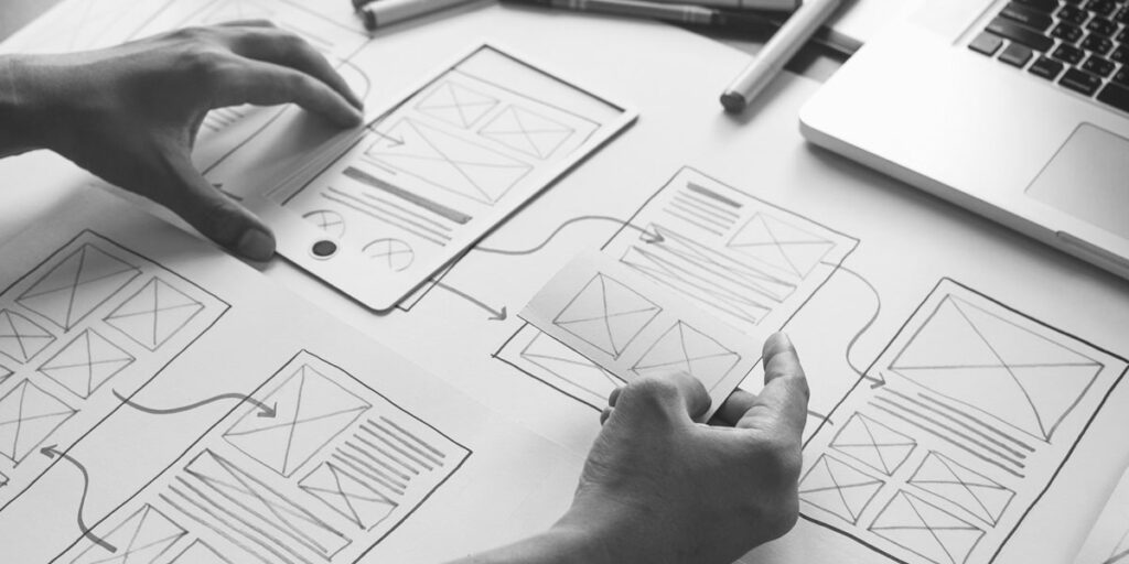
This process differs from product to product but may involve researching the target audience’s goals and objectives, journey mapping the user’s pathways, designing information architecture and navigation and designing wireframes.
What is UI design?
Research has shown that users decide whether or not they like your website in 50 milliseconds. How your website looks matters! The aesthetic and overall look and feel of the site play a major role in how customers experience your website.
User interface design or UI design is the process of designing how the website or app looks and functions. Usually, this comes after UX, once the user journey has been set, which will create the bare bones and outline the content, then the UI design is filling it in with visuals and interactive elements, for example:
- Visual design of the product, including high fidelity wireframes and mockups of page and screen layouts
- Visual aesthetic including colour, typography, graphics and imagery (guided by your brand style guide)
- Appearance of elements including buttons, icons, toggles, menus, navigation systems (consistent with your branding, aesthetically pleasing but also intuitive and accessible)
- Animation and movement – what happens when users interact with the elements on your site when they scroll, click, drag, etc.
For a good UI, you need good branding and brand guidelines. Then, it is simply bringing your brand to life in a way that creates a positive experience for your users.
Creating a website or app that your users love requires good UX and UI.
Convinced yet?
Here are some examples:
1. Pinterest
Pinterest is a fantastic example of good UX design.
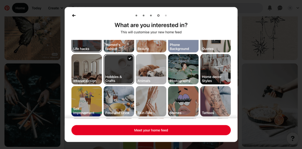
On sign up, you are onboarded straight away. Pinterest asks quick questions via a modal to create a feed tailored to your specific interests. This process is good UX because:
- It takes less than a minute
- The progress bar at the top lets you know where you are, and what to expect, and the back arrow allows you to move backwards (you are in control)
- The end result is a website experience unique to the user
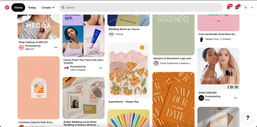
Further reasons:
- Pinterest is a visual site and the home feed gives the user exactly what they are there for – inspiration!
- It is intuitive: a first-time user will see their home feed, and as they move their mouse or tap a picture, they will be prompted to save the pin and create a board.
- 8 in 10 Pinterest users say the platform makes them feel good (the definition of a positive user experience).
- It also works just as well on a desktop as it does as an app – it is a seamless experience across devices.
2. Apple
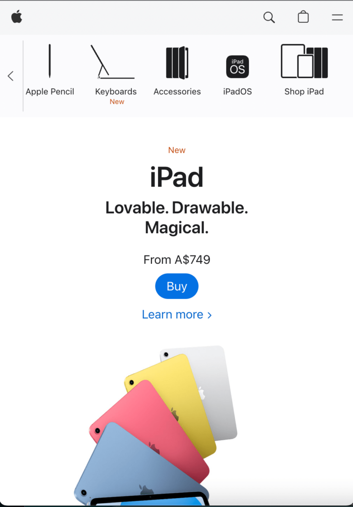
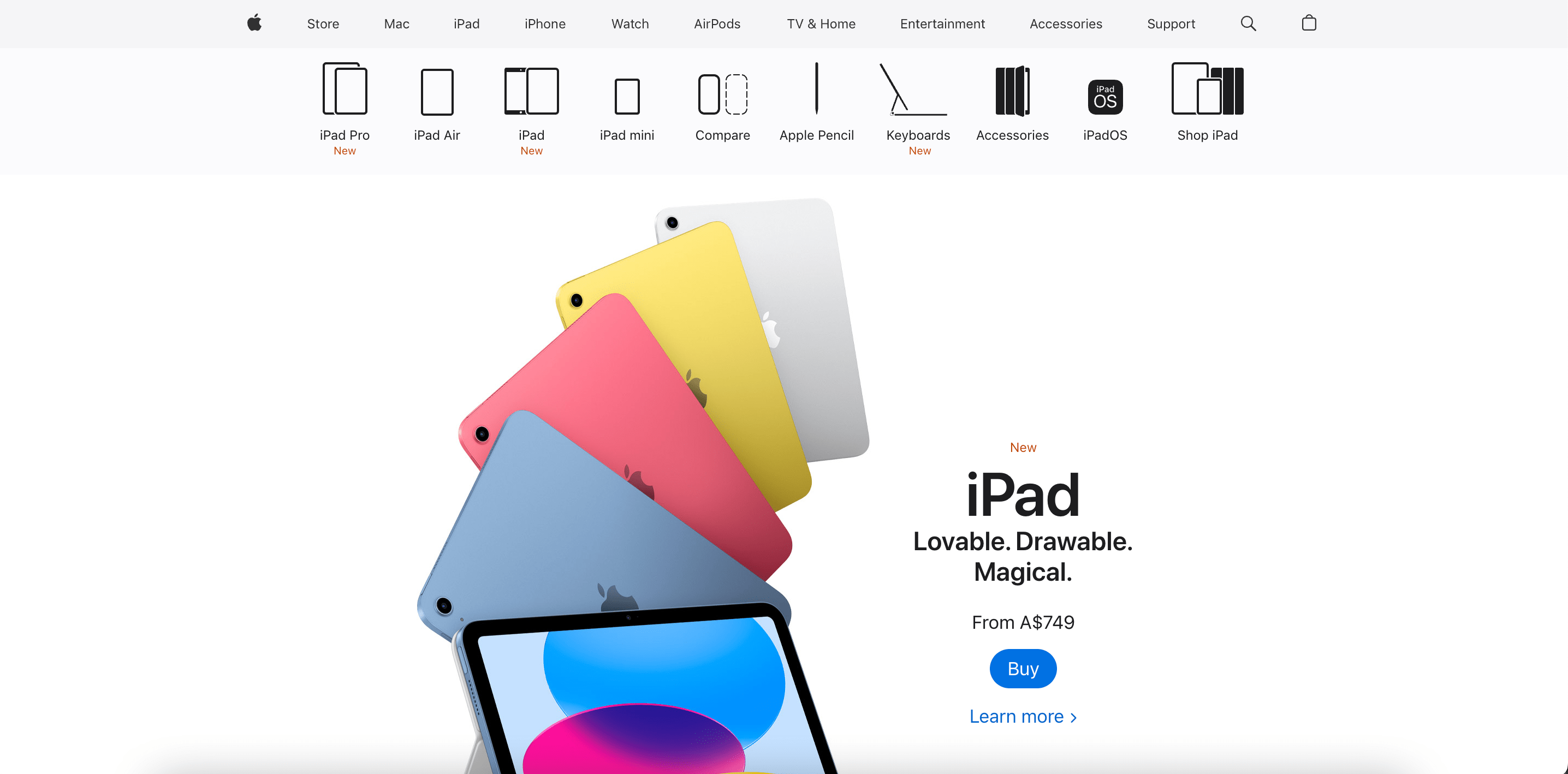
Again, Apple’s entire website used UX best practices, but let’s just look at the navigation. Depending on which product you click on, you get a different second bar with product categories and icons. It is intuitive and easy to find what you are looking for.
3. Airbnb
Airbnb’s website and app are fun and easy to use. The home page encourages users to search and explore, the individual pages give all the information you could want in an easy-to-digest format and the booking process is smooth. But let’s just look at the search page for now.
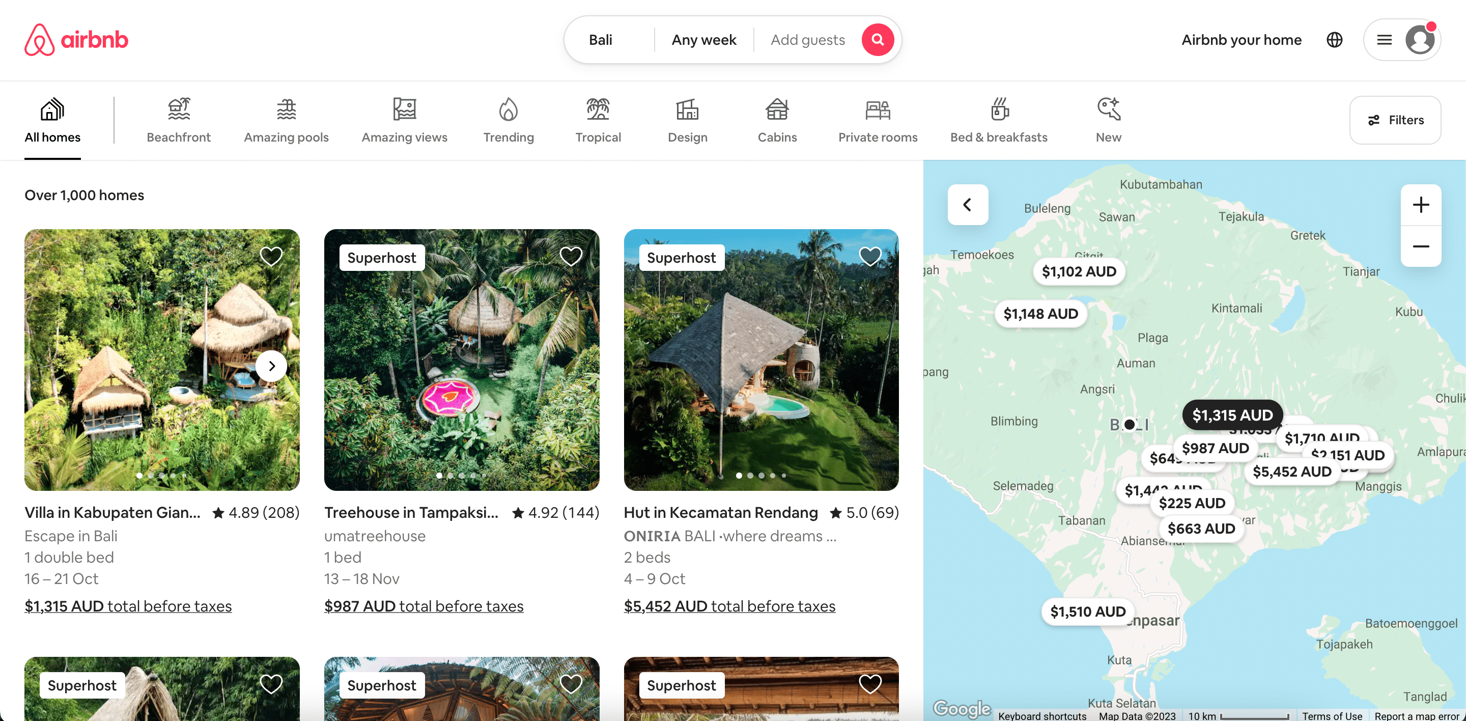
The split screen showing the map with the prices and then the homes themselves give you an entire picture of your accommodation options. Without leaving this screen, you can view homes in the exact area you want and click through photos to see what it looks like without navigating away. You also see the price, ratings, and of course – the super host status. It is so fast to find what you want, save options for later and move around, change filters and explore. The icon filters are a nice touch – users use Airbnb for a unique experience, so it makes sense to make unique features and offerings easily accessible.
4. Good Pair Days
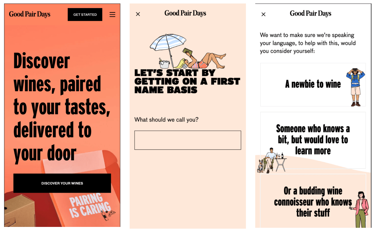
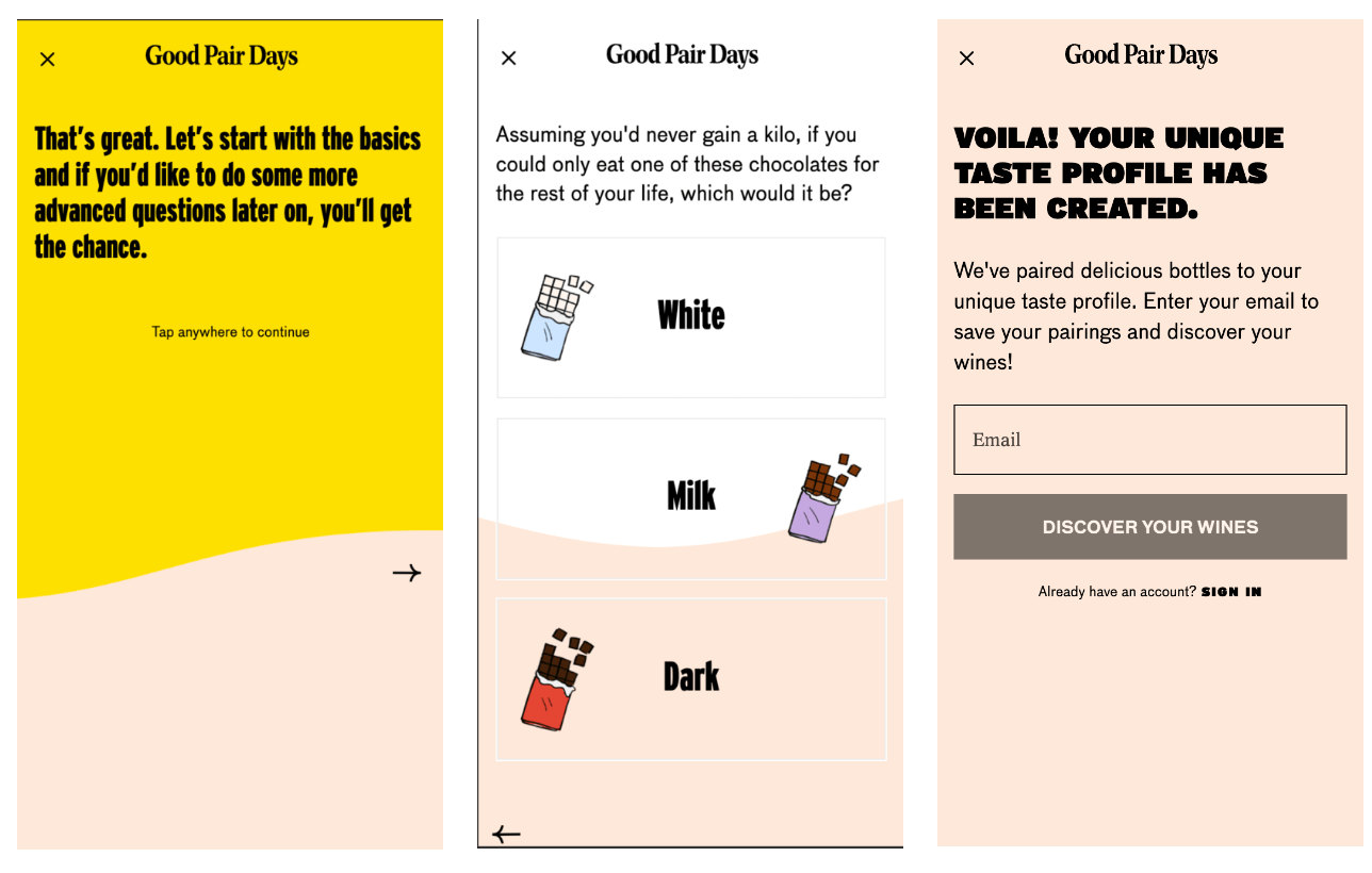
Let us take you on a journey. Good Pair Days have a unique onboarding quiz that isn’t just seamless, it’s FUN! The quiz determines your personal taste profile and then pairs wines to your tastes and requests. From here, they send you bottles, and the user then gets to rate the wines to improve future recommendations. There is a perfect balance of user control and friendly expert guidance throughout the platform. They know their audience and they escort the user through the entire process like you’re a new friend. Their user experience also reflects their branding as playful and engaging. They also gamify some of the user interactions which engages the user and creates a positive experience for them.
Now that you understand UX and why it is so dang important, let’s look at some key ways to improve or optimise user experience. Check out our blog here.
