Leading the way in coffee & tea supplies.
THE SITUATION
Ottimo Coffee is leading the way in coffee & tea supply, equipment and service. They have been roasting, brewing, sipping and providing the best in coffee and tea to businesses around Australia since 2007.
In 2018, Oraco was engaged to rebrand the business, starting with product packaging and a new website. Ottimo supply to a range of industries, including cafés, restaurants, bakeries, car dealerships, corporate & workplace, food service, sporting facilities and homes. This meant it was important for the rebrand to appeal to a range of audiences and stand out on display in cafés and restaurants, as well as look good in corporate environments.
THE SOLUTION
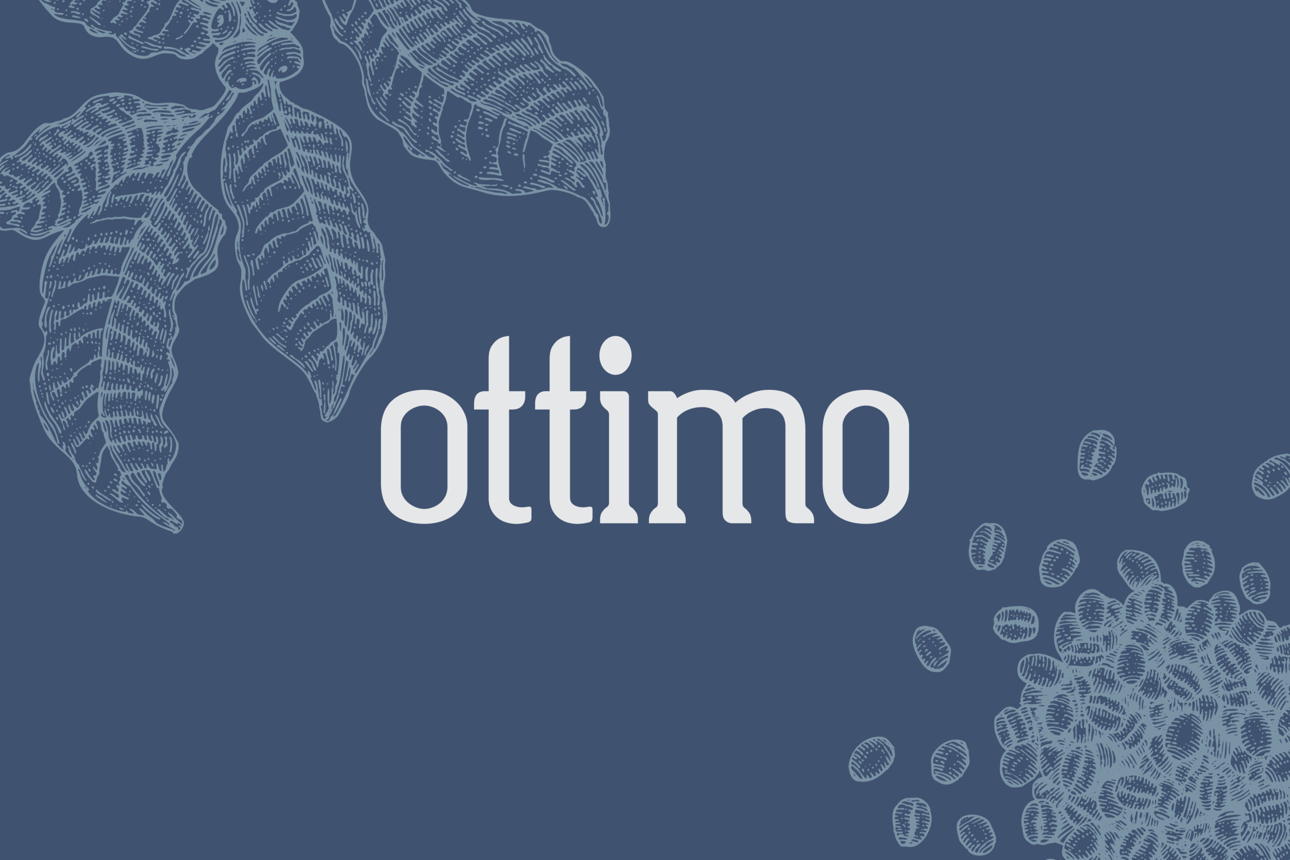
Oraco began the rebrand with a simplified logo. We dropped the word ‘coffee’ along with the coffee bean as the business had expanded its service offering since the original logo design. This left us with a modernised wordmark that was still recognisable to their existing customers.
For the rebrand, we brought in some simple line illustrations of ingredients and equipment. This style is modern and minimalistic, keeping to the design trend among café coffee brands, however, bringing in a classic point of difference that also works well within corporate environments.
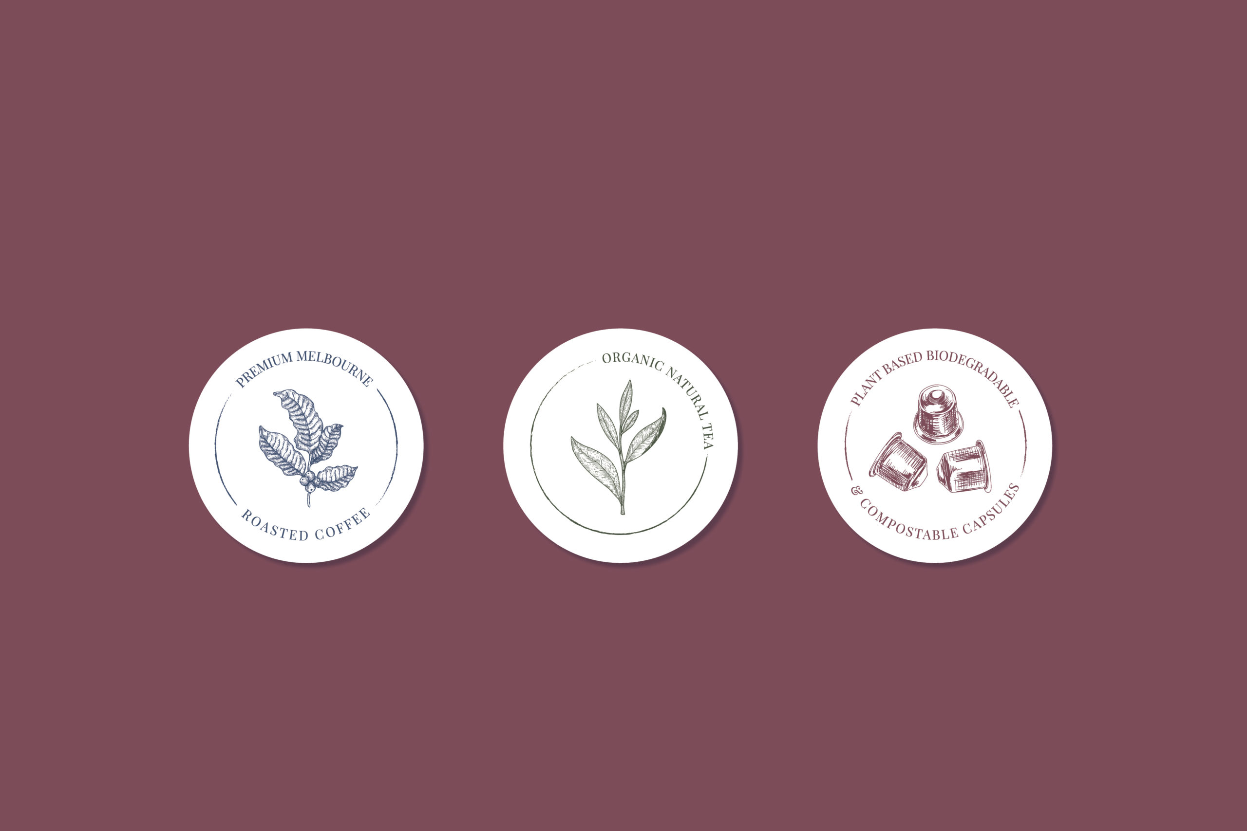
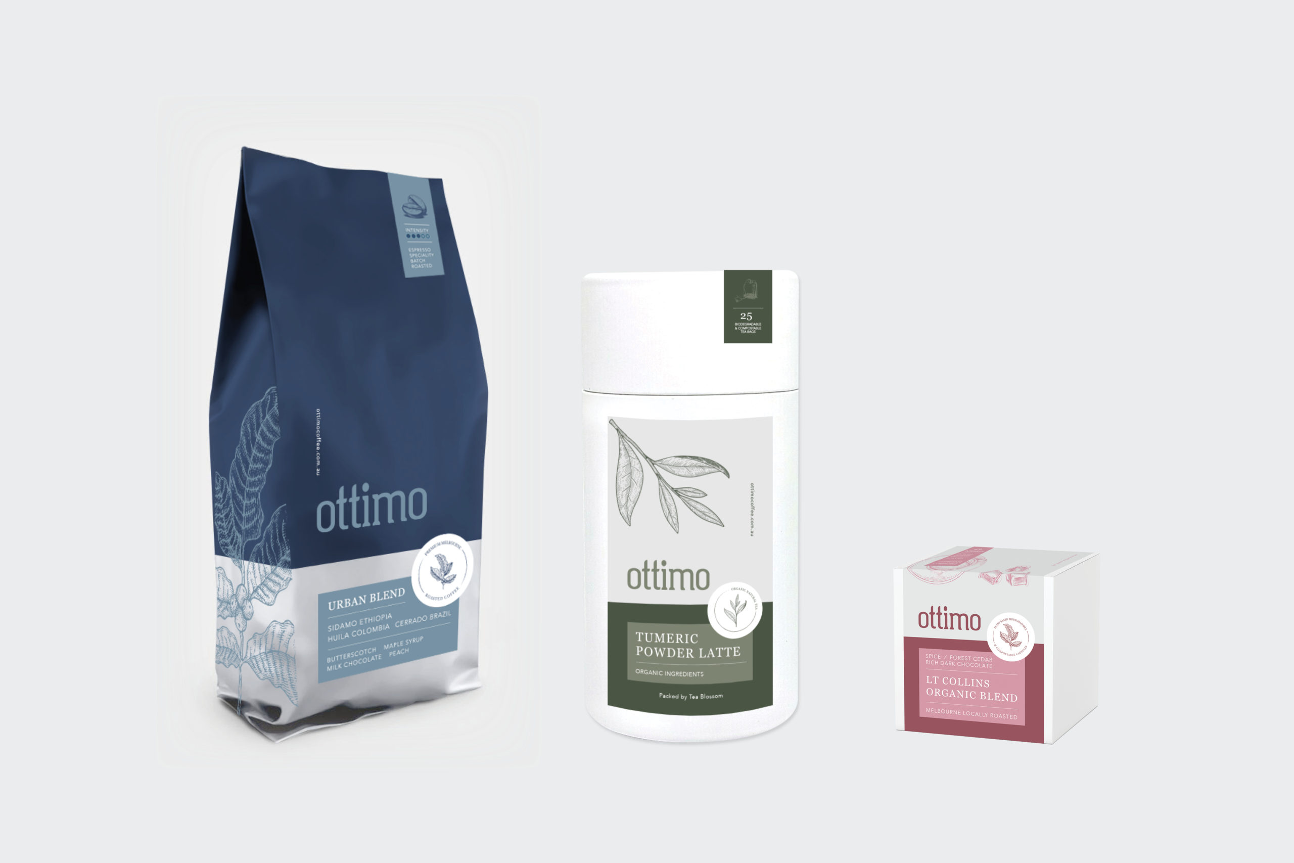
The colours chosen are warm, deep and earthy symbolising the natural, organic side of coffee and tea. The 3 primary colours chosen include navy, blush and olive which represent the different product ranges; ground coffee, coffee capsules and tea. From there a range of tones were selected from each primary colour to use for the flavours within each product range.
Once we finalised the branding, we worked closely with Flex Catering, a catering software company, to design a new e-commerce website. The previous website had eCommerce functionality; however, it was outdated and inconsistent with Ottimo’s product packaging and lacked brand recognition. Oraco designed the website based on the chosen Flex Catering website template with a modern, easy to navigate online store.
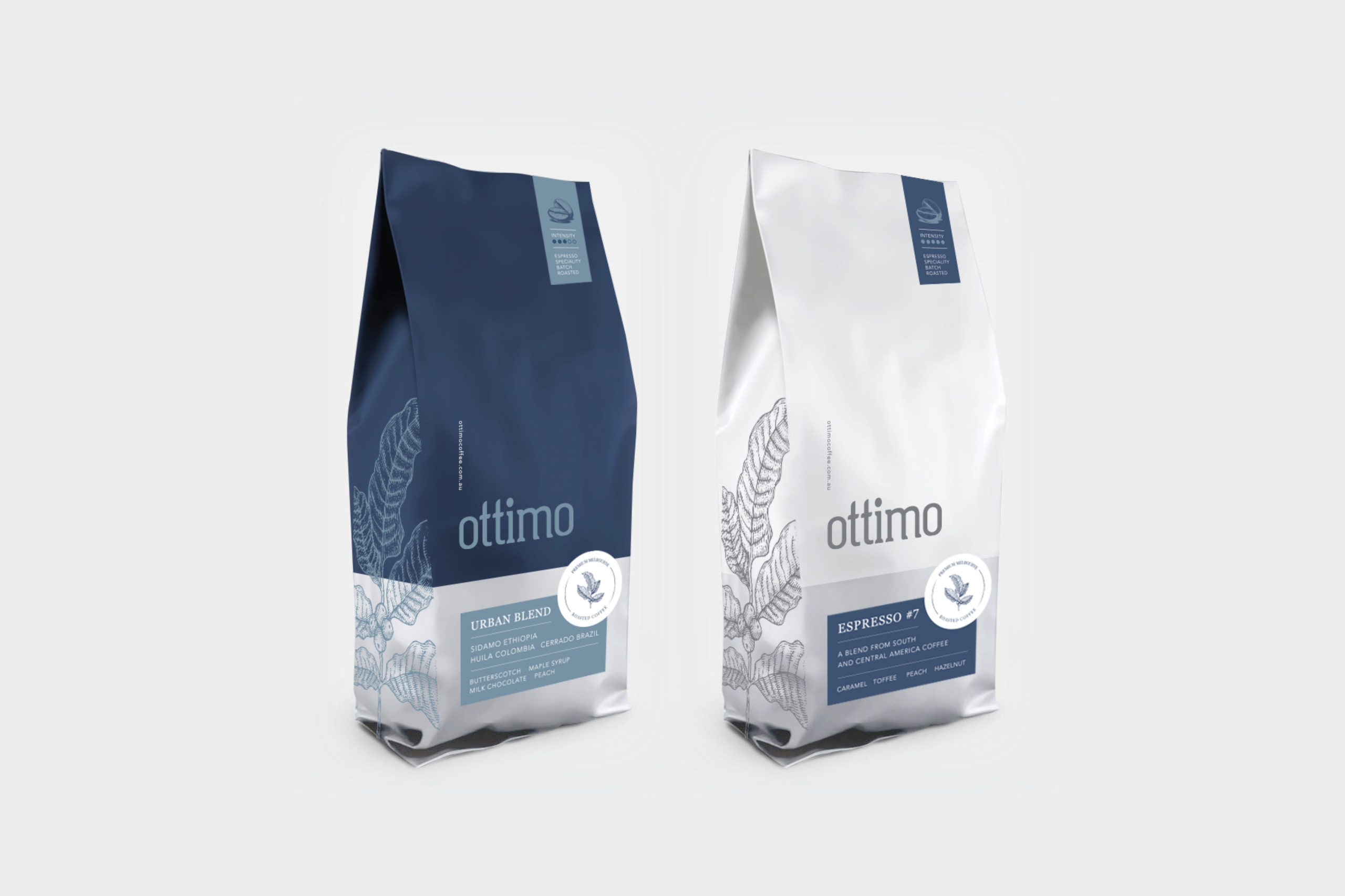
After the new website launch, Ottimo’s product packaging was rolled out. The new coffee packaging features the branded line illustrations on the side gussets of the bags to keep the front clean so that the many important features of each blend could be clearly communicated. The main features communicated are the blend name, tasting notes and location sourced. The secondary messaging is featured in a tab at the top of the packaging that identifies the intensity type and whether the coffee is full beans or ground. A final third message is placed within a circle stamp style label, emphasising their locally roasted message.
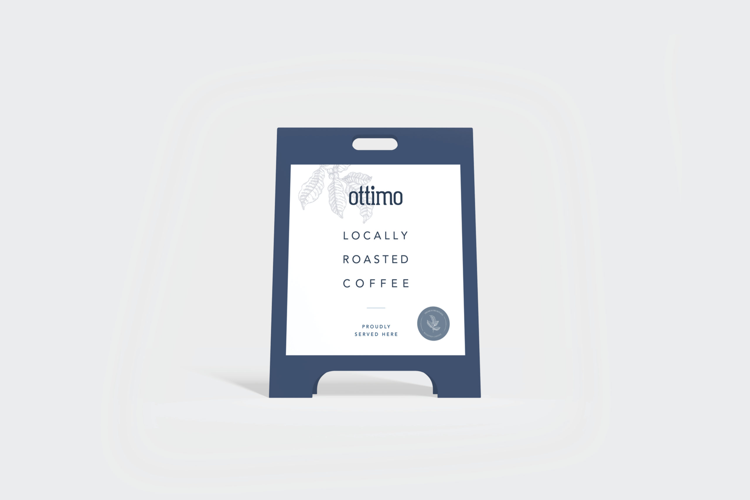
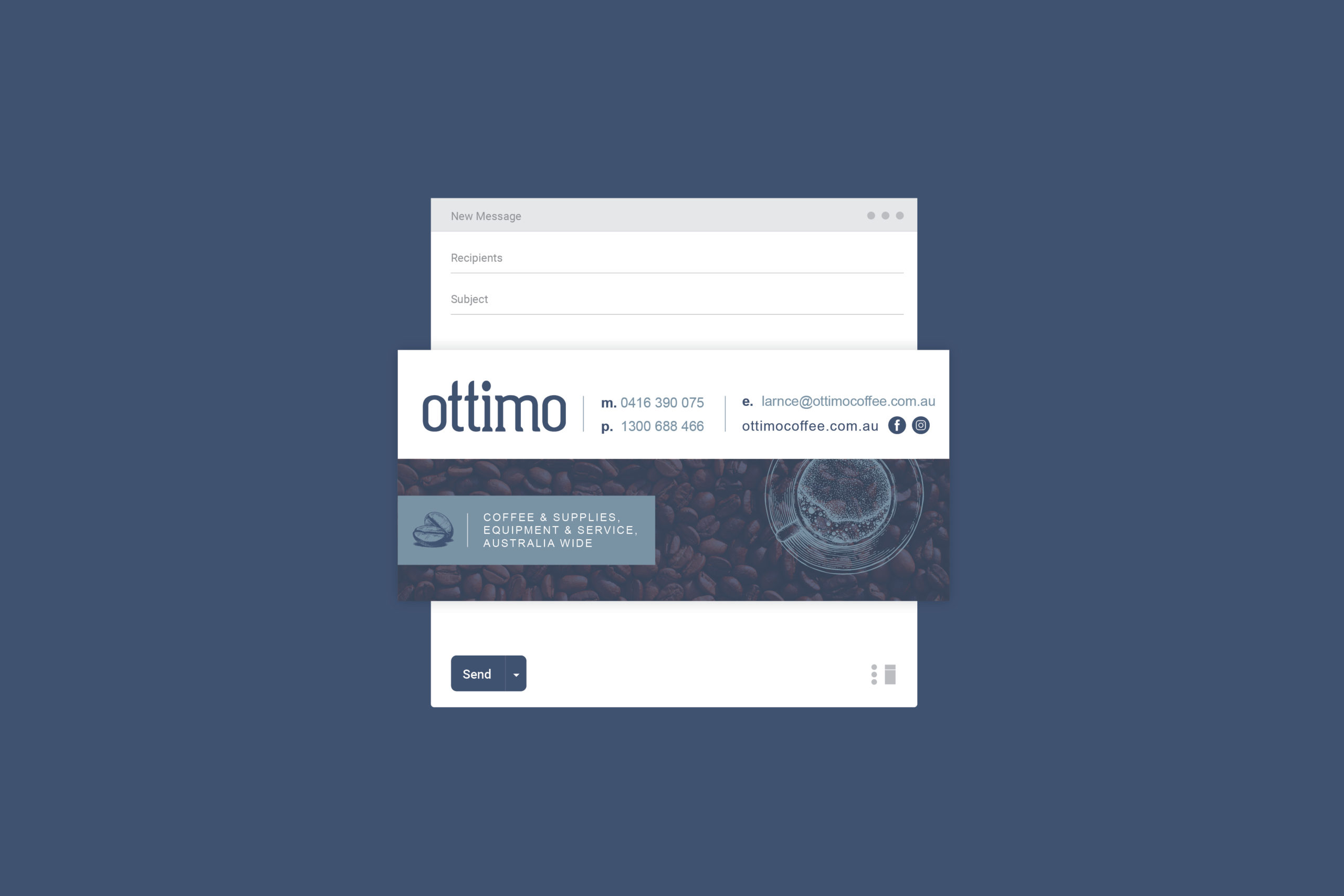
Once the packaging was finalised, the new branding was rolled out across their corporate stationery, email signatures, email marketing, signage and apparel.
THE RESULTS
We continue to work with Ottimo to maintain their brand consistency and design additional packaging, marketing collateral, signage and apparel as they need.
CLIENT
Ottimo Coffee
BRAND ETHOS
Vision: To lead the way in coffee and tea supply, equipment and service.
Values: Quality, Passion, Sustainability, Community
WHAT WE DID
Brand Identity, Corporate Stationery, Marketing Collateral, Packaging, Website Design, Website Development, Social Media Branding, Copywriting, Email Marketing, Signage, Apparel
