In a world full of brands competing for your attention, have you ever wondered what makes you choose one brand over another? Is it the logo, the packaging, or perhaps the catchy slogan? While these elements certainly play a part, we’re here to discuss one silent influencer that often goes unnoticed – colour.
Let’s dive into the realm of colour psychology, where colours transcend aesthetics and emerge as powerful tools of persuasion.
The psychology behind colour
Think about the last time you saw a fiery red sports car and a serene blue ocean. Did they make you feel the same way? Probably not. That’s because colours have a remarkable ability to evoke specific emotions.
Colour psychology examines the psychological and emotional effects of different colours on individuals and seeks to understand how these effects can be harnessed in various contexts, including marketing, design, and branding.
The idea behind colour psychology is that colours can evoke specific emotional responses, influence mood, and even affect decision-making. Different colours are believed to carry distinct meanings and associations, and these can vary across cultures and individual experiences.
In branding, emotion plays a crucial role in establishing a deep and lasting connection between a consumer and a brand.
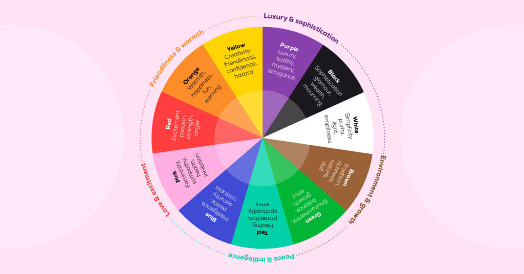
We’ve unpacked some popular colours and their associated meanings below.
Blue: The trustworthy and calming companion
Blue is the colour of trust and dependability. Brands like PayPal, Visa and Telstra use blue to signify security and reliability. Social media giant Facebook chose blue, perhaps as a reminder that they’re your trusty digital account.
Positive: Intelligence, reliability, security, trust, professionalism, calmness
Negative: Coldness, obscenity, depression
https://www.pinterest.com.au/pin/814236807610508476/
Teal: The colour of versatility
Teal is often perceived as a unique colour. It stands out without being overly bold, making it a popular choice in fashion, design, and branding for those seeking a refined and distinctive look.
Positive: Healing, protection, spirituality, uniqueness, balance, harmony
Negative: Unconventional, envy
https://www.pinterest.com.au/pin/207728601555506815/
Green: The colour of growth and health
Green, the colour of nature, is often associated with growth, health, and freshness. Brands like Boost and Subway use green to emphasise their natural, healthy offerings. Woolworths also chose green to align with their brand positioning as ‘the fresh food people’.
Positive: Health, freshness, environmental, balance, growth, peace, good luck
Negative: Jealousy, illness, greed, corruption, envy
https://www.pinterest.com.au/pin/76772368638361686/
Yellow: The sunshine of positivity
Yellow is all about positivity and happiness. Brands like McDonald’s (yes, them again), Vegemite and Optus use yellow to create a fun, vibrant brand.
Positive: Creativity, happiness, positivity, friendliness, confidence, wealth
Negative: Deceit, depression, hazard, cowardice
https://www.pinterest.com.au/pin/698761698473289333/
Orange: The colour of creativity and inspiration
Orange is often considered a creative and inspiring colour. It is used to stimulate creative thinking and expression. Many artistic and design-oriented industries incorporate orange to convey innovation and originality.
Positive: Warmth, inspiration, happiness, innovation, flamboyance, fun
Negative: Over emotional, frustration, warning
https://www.pinterest.com.au/pin/611222980702346323/
Red: The colour of love and urgency
Red is known for urgency and passion, so it’s clear why fast-food giants, like McDonald’s and KFC, use it to direct you through their doors. Red is also the colour of love, making it a favourite for brands like Coca-Cola, who aim for consumers to fall in love with their products.
Positive: Excitement, urgency, warmth, love, fire, strength, passion
Negative: Aggression, war, danger, revolution, defiance
https://www.pinterest.com.au/pin/766878642790609244/
Pink: The colour of femininity
Pink, a colour often associated with romance, sweetness, and playfulness. Pink is also known for its calming effect, offering a gentle and soothing atmosphere. Beyond its associations with femininity, pink is increasingly breaking gender stereotypes and is being embraced for its versatility.
In branding and design, pink is utilised to convey a sense of warmth, approachability, and youthful exuberance.
Positive: Femininity, sympathy, health, love, romance, playfulness
Negative: Weakness, inhibition
https://www.pinterest.com.au/pin/785948572487657748/
Purple: The colour of royalty
Purple has been linked to royalty and luxury because of its rarity and expense associated with obtaining purple pigments. It can evoke sophistication, spirituality, mystery and intrigue.
This colour has become synonymous with the brand Cadbury and plays a key role in the company’s visual identity. It is not only visually appealing but also carries positive associations linked to luxury, quality, and a sense of treat-worthy delight.
Positive: Luxury, quality, sophistication, intrigue, mystery, wisdom, spirituality
Negative: Arrogance, gaudiness, profanity, inferiority
https://www.pinterest.com.au/pin/748301294361100019/
Black: The colour of elegance and sophistication
Black exudes elegance and sophistication. Brands like Chanel and Apple opt for black to make a bold and confident statement.
Positive: Glamour, elegance, security, sophistication, wealth, confidence
Negative: Fear, mourning, oppressive, heavy
https://www.pinterest.com.au/pin/326862885471059873/
Brown: The earthy ally
Brown is a colour commonly found in nature, from soil to trees, and is associated with the organic and natural world. It can be used to evoke feelings of warmth and authenticity, making it a popular choice in eco-friendly and natural products.
Positive: Calm, reliable, nature, tradition, richness, warmth, authenticity
Negative: Dirt, dull, poverty, heaviness, simplicity
https://www.pinterest.com.au/pin/31877109852115381/
Cultural significance
In addition to their emotional impact, the meanings of colours can take on unique nuances in different cultures around the world.
Colours often carry deep cultural significance, influencing perceptions and conveying messages that may vary widely across diverse societies.
For instance, while white may symbolise purity and new beginnings in Western cultures, it can represent mourning and loss in some Eastern cultures. Similarly, red, commonly associated with passion and energy in the West may signify good luck and prosperity in many Asian cultures.
Understanding these cultural variations is integral to crafting a brand that resonates universally, emphasising the importance of a considered approach to colour choices in the global landscape of branding.
Colour combinations and their magic
Remember, it’s not just the individual colours that matter, but also how they are combined. Think about the vibrant interplay of colours in a Coca-Cola ad or the modern, tech look of an Apple ad. These combinations are designed to create visual harmony and capture your attention, keeping you engaged.
The below example for Nike Air Jordan’s pairs the passion and urgency of red with the femininity of pink. This bold colour combination balances the aggression often associated with red with the calmness associated with pink.
https://www.pinterest.com.au/pin/671106781987246239/
Nikon pairs the sophistication of black with the fun and positivity of yellow, evoking trust in the brand’s professionalism and quality design, whilst tapping into the fun and adventurous side of a photographer’s nature.
https://www.pinterest.com.au/pin/302163456265217614/
The law of first impressions
In the world of branding, first impressions matter. Research shows that consumers make a subconscious judgment about a product within 90 seconds of seeing it, and up to 90% of that judgment is based on colour alone.
So, if you’re thinking about launching a brand, choosing the right colour is like dressing up for a first date – it’s crucial to get it right.
There are no strict rules
The beauty of colour psychology in branding is that it’s more art than science. While there are general associations with certain colours, individual experiences and cultural backgrounds can lead to different interpretations, so don’t be afraid to think outside the box.
If you need support with developing your brand identity or including your colours, we’d love to help! Get in touch.