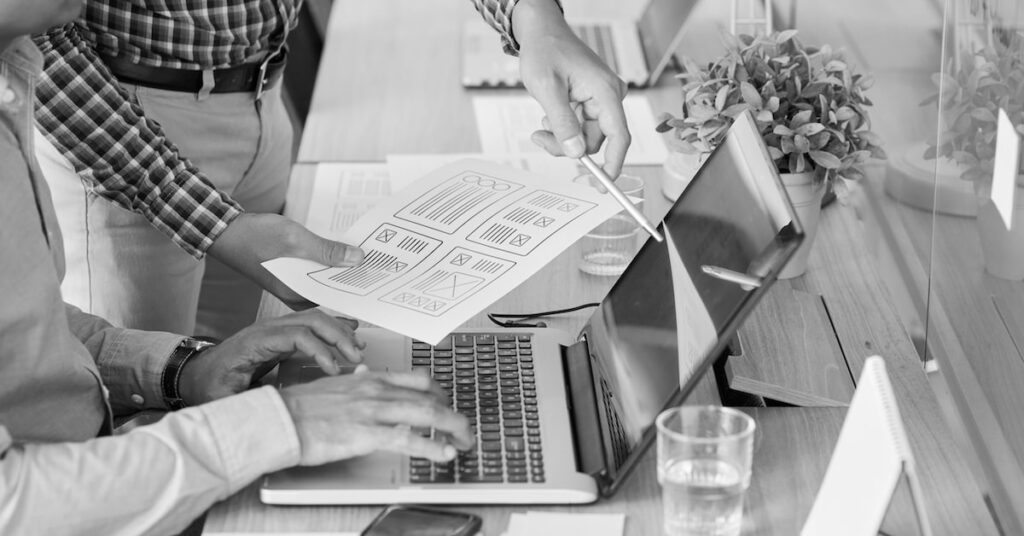
Website design has come a long way in the past 30 years, with ever-evolving technology, meaning that we are constantly discovering new capabilities, opportunities, standards, and user expectations that need to be considered. In web design, we see design trends that are not only influenced by tech capabilities, but also fashion, culture, art, social media etc. This means that there are always new and exciting ways to bring brands to life in the digital sphere!
2023 has been no exception when it comes to website design trends. This blog lists some of our favourite websites and trends from the year that we think will stand the test of time and what businesses they best suit.
Website design at a glance
When it comes to the digital world, websites often need to be updated to reflect the changing times. Updating a website from a functionality standpoint can also be an opportunity to refresh the design. You want your user to be pleasantly surprised at their experience on your site, as with nearly 2 billion websites online, standing out can be a challenge. As a creative agency, we get excited about new updates and are always looking to celebrate good design and creativity.
While it’s important to keep your brand fresh and your website updated, it’s equally as important to consider your brand strategy and not just jump on any passing trend or fad unless it aligns with your brand.
Looking to create or refresh your strategy? Book a chat with our expert team.
1. Engaging scrolling experiences
Why we love this trend:
One trend we love is immersive scrolling experiences that take the user on a journey. They can feature all sorts of things, including:
- Revealing new information as the user scrolls
- Crossfading imagery to tell a story
- Changing background colour or elements
- Animated feedback
These features can be simple, elegant, creative, and fun – whatever suits your brand! Not only do these experiences delight and surprise the user, but they are also very efficient. These features are immersive and engaging, focusing on one thing at a time. They can be a clever way to ensure that the user actually reads and digests the information on the screen without being overwhelmed. It means that while the user feels in control, the business chooses exactly what they see.
Scrolling is also the most common way a user engages with a screen, so no learning is needed, which makes this suitable for all audiences.
Best for:
Traditionally tech companies, but nowadays, we can see scrolling storytelling across most industries. If you have a story to tell, then you can utilise this feature! They work best for homepage and marketing landing pages, product or service explainers, feature reveals, statistics/infographics, or other stories like a timeline or brand story.
Examples:
2. Maximalism
Why we love this trend:
One web trend we are very excited about is the beautiful chaos that is maximalism. It provides an exciting contrast to the uber-popular minimalistic web trend, which everyone is overtly familiar with. But rather than the minimalist’s ‘less is more’ approach, maximalism turns minimalism on its head with a ‘more is more’ vibe. It provides a whole new realm of possibilities when it comes to user experience and user interaction.
Something that we love about this trend is that it is all based on experimentation, and there are no boundaries. This gives designers complete creative control – there is no risk of same-same, meaning brands can stand out and be unique.
Some ways that designers can do this:
- Colourful, flashy graphics
- Mixing multiple fonts, layouts and size
- Looping videos
- Repetition – creating unexpected patterns
- Fill up every space – think chaos
- Layer up! Stack elements – think 3D
Best for:
This trend isn’t for every brand. Knowing your target audience is key here because some people will hate it. One thing’s for sure though, it will definitely make them stop and look!
This quote sums it up perfectly:
“There is tension between chaos and order, patterns within patterns, and clashing colors. Maximalism can be aggressive, off-putting, and polarizing. One reviewer called this “rather ugly,” and another said it was one of the most beautiful books they’d ever seen. People either loved it or thought it was hideous. You have to be aware of that.”
– Keeli McCarthy
Examples:
In the home:
Graphic design:
Websites:
An example of a brand doing this is Blue Rock not exactly what you would expect for accountants! But they know their target market. “BlueRock is for entrepreneurs, by entrepreneurs.” They are disruptors, and their website reflects that!

Another example is Up Money, which doesn’t look like an ordinary bank. Their maximalism approach also is part of their brand – they don’t want to be like other banks – and they aren’t!
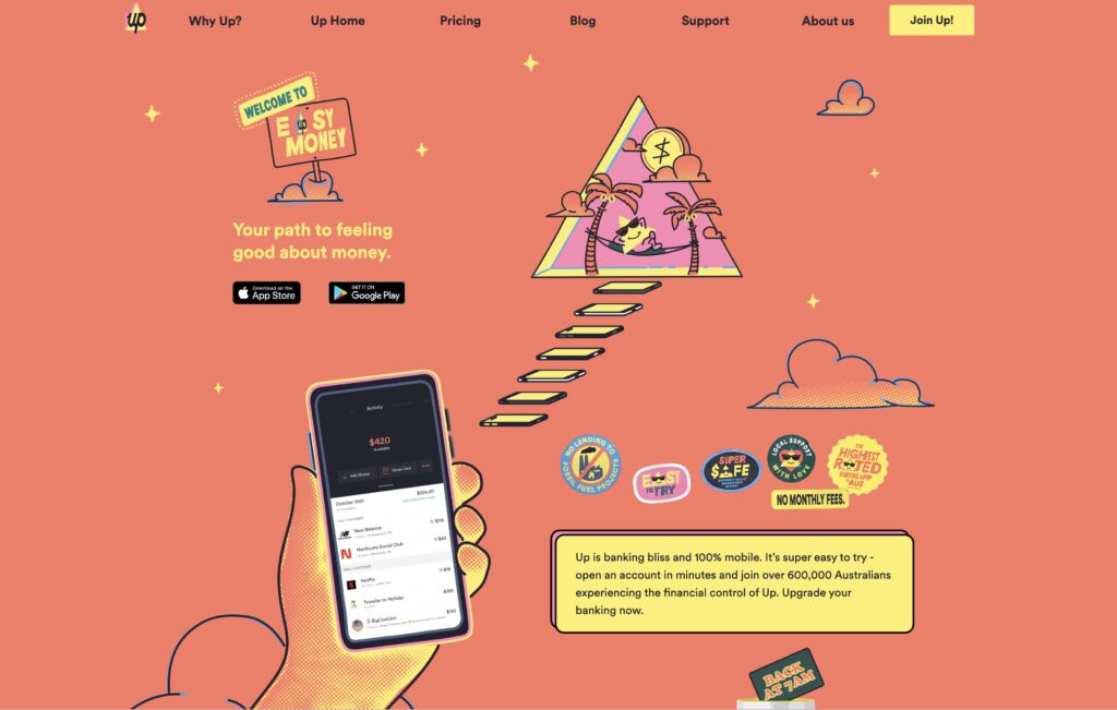
3. Humanizing with handmade graphics
Why we love this trend:
Websites are a digital experience, and with everyone spending more and more time on screens, there is an opportunity to stand out and give your users a breather from the tech clutter by using rough, handmade graphics. Imperfect, organic DIY graphics give websites a human touch that can give your brand personality and make you seem more approachable. It also assists in making users feel comfortable and happy. Using scribbles, doodles, illustrations, messy cutouts, textures, paint, crayon, paper, and collage are all welcome here!
Best for:
Sites where you want your user to feel good, happy, comfortable, relaxed, inspired, warm and, invited.
Examples:
4. Create immersive experiences with interactivity
Why we love this trend:
One of our favourite trends is the continuously improving interactive features that we have to play with on websites. We are starting to see large and small-scale animations that encourage users to click, swipe, drag, hover and explore. We are invited to engage with sites rather than just being spectators. This is something we are seeing in exhibitions and art and will continue to see as technology evolves. These novel experiences are fun, surprising and captivating.
Interactive features are also extremely useful and user-friendly. Things like floating ‘back to top’ buttons, chat boxes, and full-screen menus put the user in control, so they always have options available to them. They also allow for a minimal header.
3D effects are a fantastic way to add depth and create an immersive experience.
Interactive, accessible features that allow users to change the language, font size and even site colour are wonderful, inclusive additions that we are seeing more frequently.
Remember, many people are distracted by moving elements, so consider the speed and the purpose first. It is best to have the user interact with the feature first (e.g. clicking, scrolling or hovering).
Best for:
Everyone! Every website can benefit from interactive features as long as they are accessible.
Examples:
Large scale animation
Spotify
3D effects
Dribbble: Dennis Snellenberg
Animations, hovers
Interesting text hover effects, check it out here.
5. Y2K nostalgia and custom cursors
Why we love this trend:
It may feel too soon for some of us, but the early 2000s is continuing its comeback in 2023. From fashion and music to social media and the web, y2k is here in full force and expected to continue throughout 2023.
While we’re seeing low-rise jeans and tiny bags in the fashion world, on the web, we are seeing pixelated icons, retro fonts, gradients, quirky cut-out graphics and stamps, custom cursors, monospaced type and floating compositions.
Some designers are taking the pixel effect across their whole design with pixelated photos, icons, fonts and backgrounds to create a fully cohesive and almost in-theme nostalgic experience. Others just take bits and pieces of inspiration from the past and mix them with modern practices to create something new.
Our favourite part of this trend is the custom cursors, which you may remember if you were online during the early 2000s. These can simply be nostalgia for nostalgia’s-sake design elements, which can delight and surprise the user. However, they can also enhance user experience. Cursors can change depending on what the user is hovering over, giving obvious and constant feedback to them. They can guide and give directions to specific interactive elements on the page or certain CTAs, encouraging users to explore and engage. They can also be a chance to add custom branding or campaign branding to your site.
Best for:
Brands with a Gen Z target market or who are playful. We are predominately seeing this trend with fashion, hospitality and entertainment brands. It can also be used in a campaign environment to mix things up!
Examples:
You can find some more fun examples of cursors here: https://www.sssolitaire.com/ and here https://studiomesmer.com/
6. Easter eggs and web-based scavenger hunts
Why we love this trend:
Easter eggs and web-based scavenger hunts are a fun and unique way to engage your audience and make them feel special and clever. They can spark brand loyalty and build a connection with your users. Some options include hidden clues on your site that only appear when you hover, password-protected pages with riddles, hidden sale codes in your terms and conditions, or full-blown scavenger hunts that take the user on a journey across your site. They can be used for a new product launch, campaign, event, releasing a new video, revealing a sale code, accessing pre-sale tickets, and can be used internally.
Best for:
Companies that have something to launch, reveal or offer.
Example:
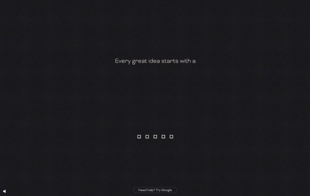
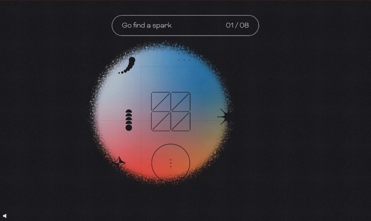
The example below was a digital scavenger hunt by agency ThreeSixtyEight to reveal the location of their employee retreat, you can test it out yourself here.
7. Bright colours, Memphis design & retro
Why we love this trend:
While web design has come a long way (and rarely do we have to navigate through a truly terrible site), we have to flick through many boring websites, which are all very same-same. We love seeing bold, bright colours and shapes everywhere, and after the last couple of years, it’s no wonder we are seeing a lot of colour in design – particularly in fashion. Old-school vibes are coming back, and we are seeing a lot of retro designs from the 90s and 00s with stickers, gradients, display fonts and outline boxes, as well as the 80s Memphis design, which rejects minimalism and focuses on the colourful, approachable and adventurous. A lot of these designs are fun, happy, and nostalgic.
Best for:
Anyone – this style can be toned up or down. It is ideal for brands that can be extra playful and trendy and add lots of colours (e.g. fashion, hospitality, entertainment, studios, agencies).
Examples:
8. Type dominate hero
Why we love this trend:
Homepage heroes with large type and fewer images are trending this year, and we love their simplicity. Fewer images and graphics reduce visual distractions, allowing the focus to land on the CTA and key messaging. Big statement type as a stand-alone design can also give a bit of mystery and focus the user’s attention, but it’s good, emotional copy in your brand tone of voice that makes these so effective.
Best for:
Businesses that want to make a statement and who are bold and modern.
Examples:
Webflow: Timothy Ricks
So, what do all of these trends have in common? They each have a sense of playfulness and creating joy with digital experiences. They aim to surprise and delight with unexpected interactions and are user-friendly focused.
Websites can bring your brand to life. If you want to refresh your website, get in touch with us.